The Colonnade Bar
PUB BRANDING, BRIGHTON, UK
The Colonnade Bar is a historic Grade II listed pub that dates back to the late 19th century and is part of the of Theatre Royal Brighton building. Its connecting door makes it the go-to for theatre goers and cast members - the walls are adorned with signed theatrical headshots from some of the pub’s more famous patrons throughout the years.
It is also a much-loved pub for locals interested in arts not necessarily of the performance variety.
The Bar had undergone some much-needed repairs and renovations as part of the wider works at the Theatre and the management team felt that it was the right time to give the pub its own distinctive visual identity.


We began our process by meeting with the team from The Colonnade Bar to learn about its history, the space and customers and perhaps most importantly to understand the deep connection that its patrons formed with the bar. Many of whom had been locals for many years and were sensitive to any changes.
This created the challenge for us to create a logo and visual identity that, whilst being completely new, felt as if it had always been there.
The pub has a quirky interior which has slowly evolved over the years with different landlords and bar staff adding their own touches to create a space which was bursting with character. The building itself features some beautiful and unique period features that added to that character and formed its own historical connections.
This history and architectural features were the inspiration for our work, and we began to identify specific elements from the interior that could be integrated into our design.
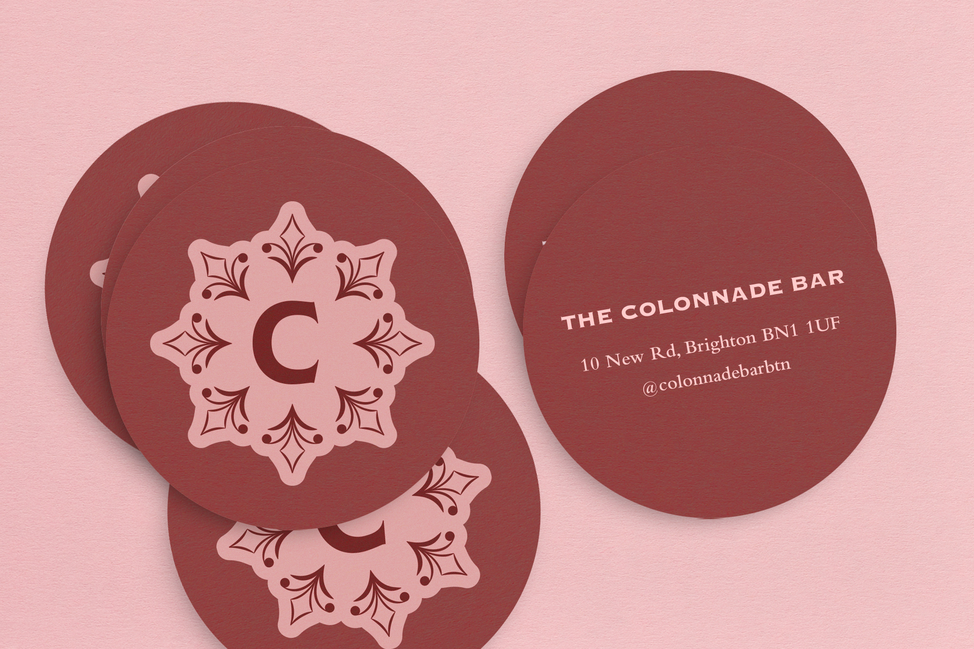
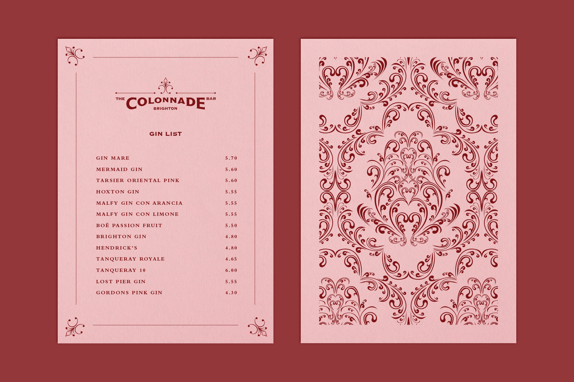
The logotype forms an arch which takes it shapes from the windows at the pub’s main entrance to the pub. These are complimented with swashes that are lifted from mouldings that can be found around the pub’s walls. The identity includes a simple monogram to be used as a shorthand alternative to the logo.
We chose a colour palette that corresponds with the building’s interior and selected a gothic typeface which is typical of Victorian display types which was customised as part of the main logo design.
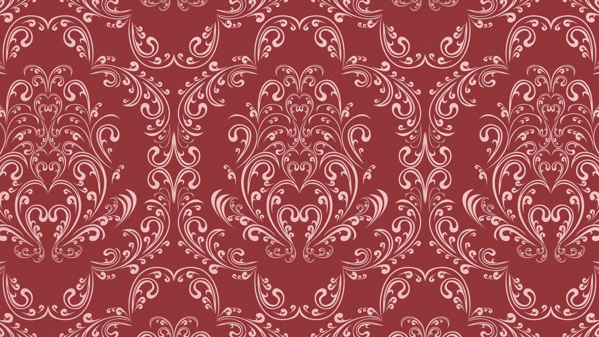
Lastly, we created a Victorian inspired pattern design which could be used as decorative element in branded applications.