Furna
FINE DINING RESTAURANT BRANDING, BRIGHTON, U.K.
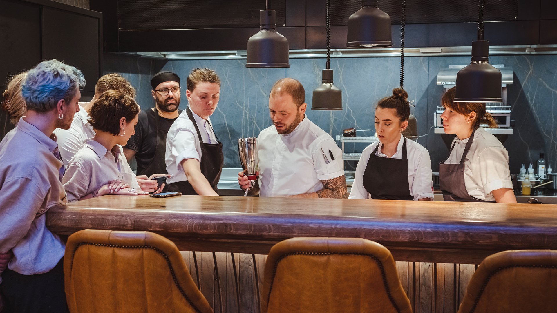
Furna is the much anticipated first solo venture for Yorkshire-born chef, Dave Mothersill. Over the last two decades, Dave has made a name for himself as one of Brighton’s most consistent and well-respected chefs, cooking in some of city’s best restaurants. His honest, uncompromising cooking has brought him local and national acclaim.
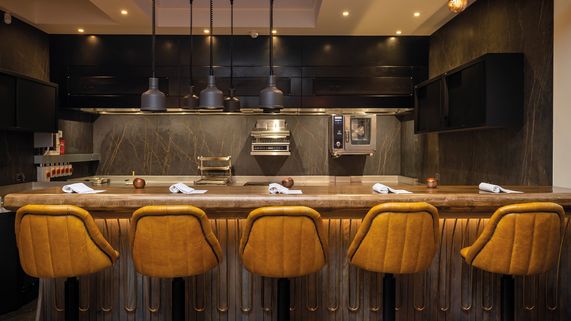
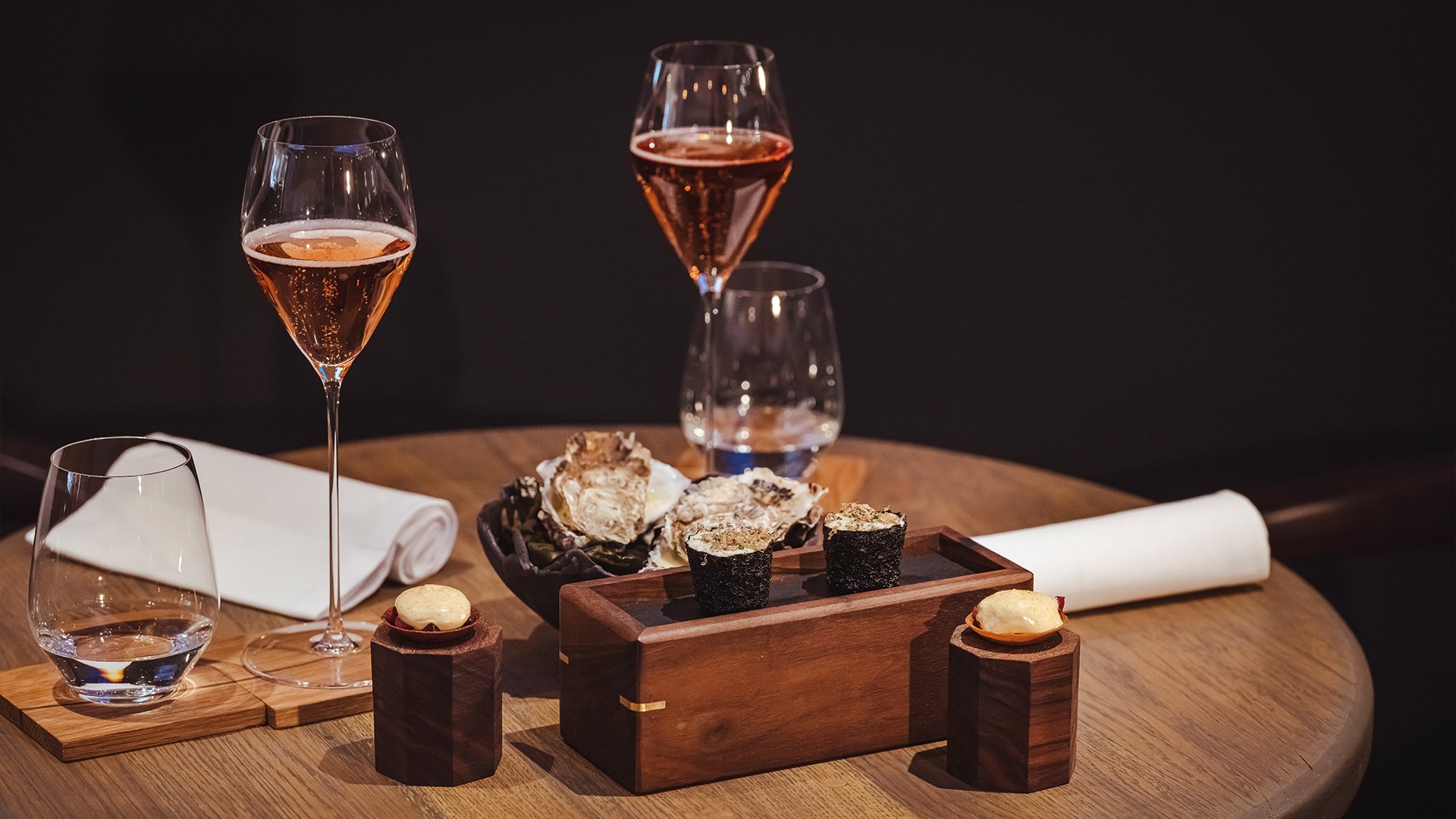
Furna offers a warm and intimate fine-dining experience. Dave invites guests to share in his vision of a unique dining experience - a set tasting menu led by quality ingredients, with an emphasis on simplicity, seasonality and sustainability served in a unique and opulent environment.
Good Noise were engaged shortly after the project’s inception to firstly help define the personality, values and DNA of the brand through a series of brand positioning workshops with the client.
As a chef led concept, the project was deeply personal to Dave, so our challenge was to allow his personality and vision to permeate all aspects of the brand.
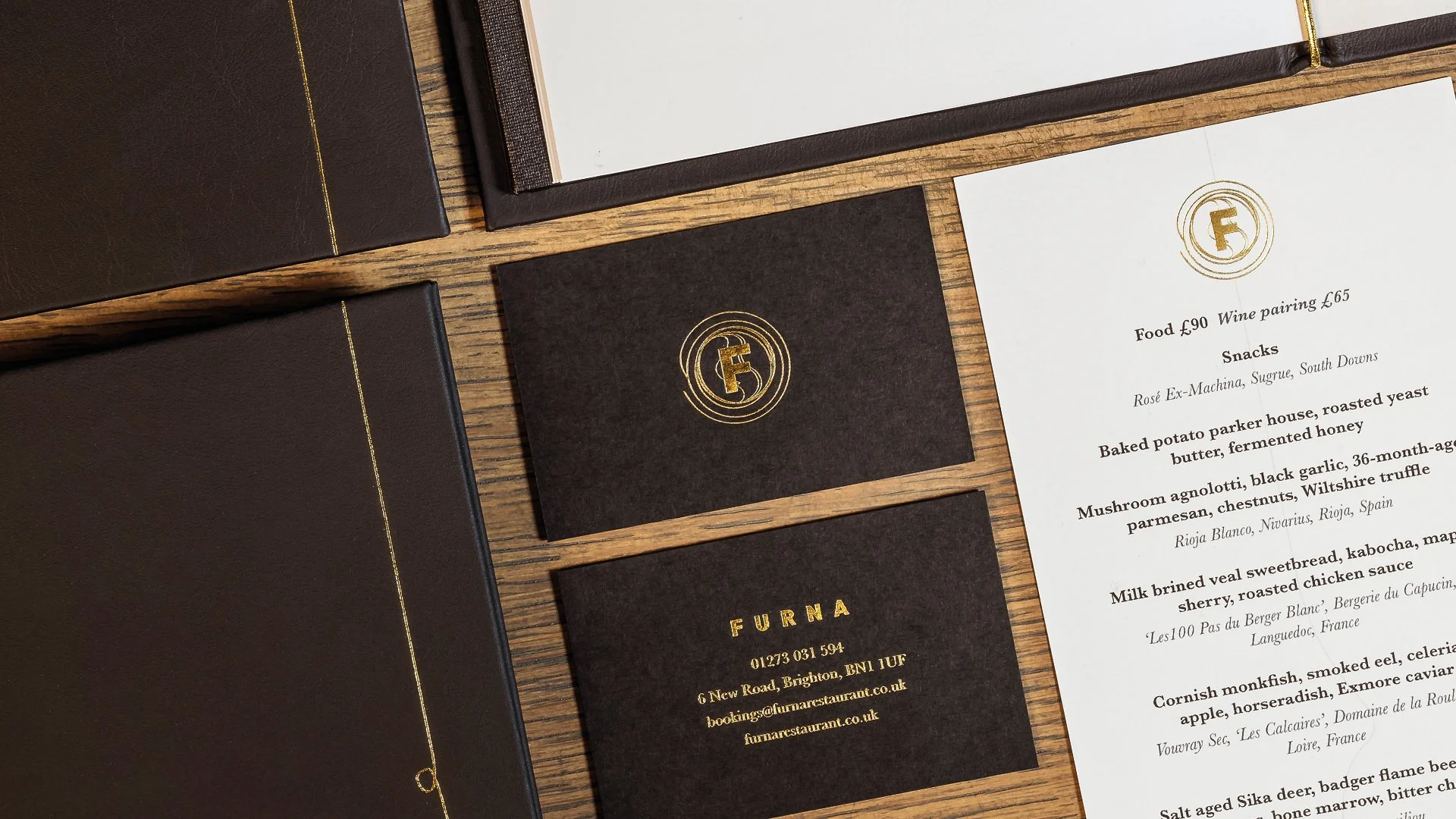
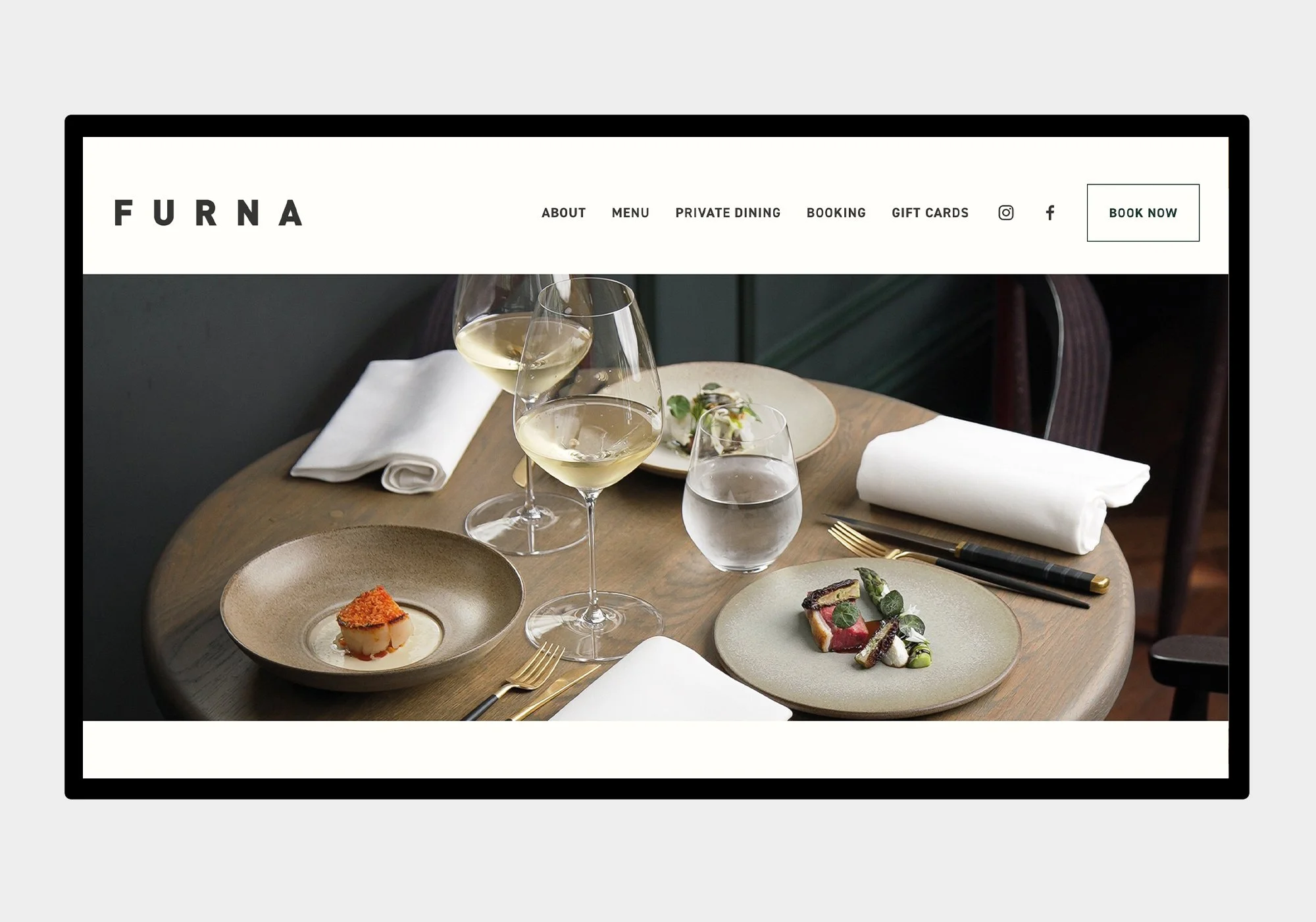
Once the brand positioning stage was complete, we then moved on to naming the restaurant and designing the visual identity, including the logo, typeface, colour palette and motif.
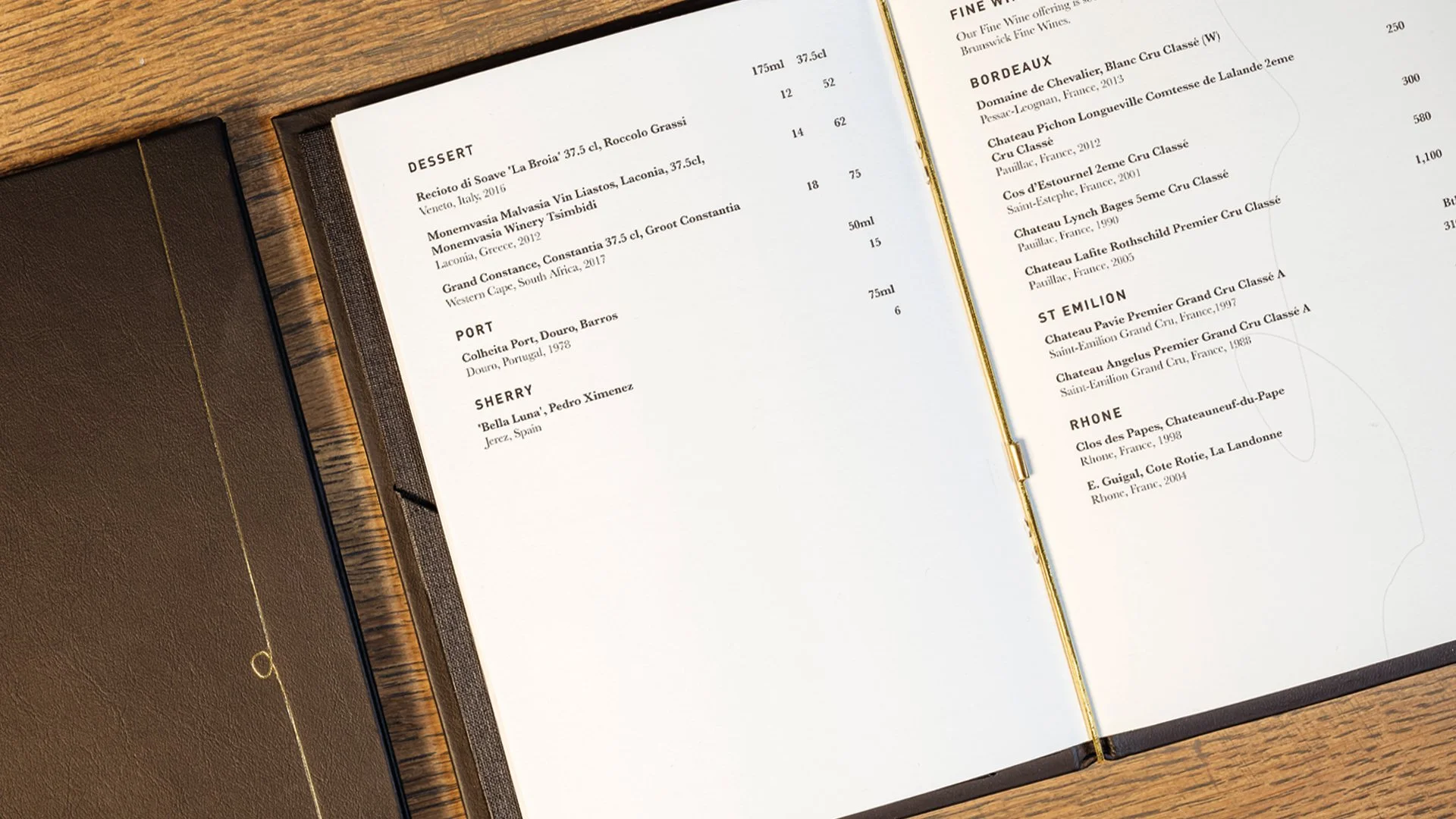
The identity was then applied to our asset designs which included exterior and interior signage, menus, print and stationery and website.

The original inspiration for the name came from the location of the restaurant on New Road, Brighton, in an area that was formally owned by the Furner family known as ‘Furner’s Garden’.
An added twist was that the name Furner finds its roots in an ancestorial occupation and means literally ‘one who sets bread in the oven’. This made a great connection to Dave and chimed with the purity and simplicity of his vision.
The spelling was updated from ‘Furner’ to ‘Furna’ to bring a sense of modernity.


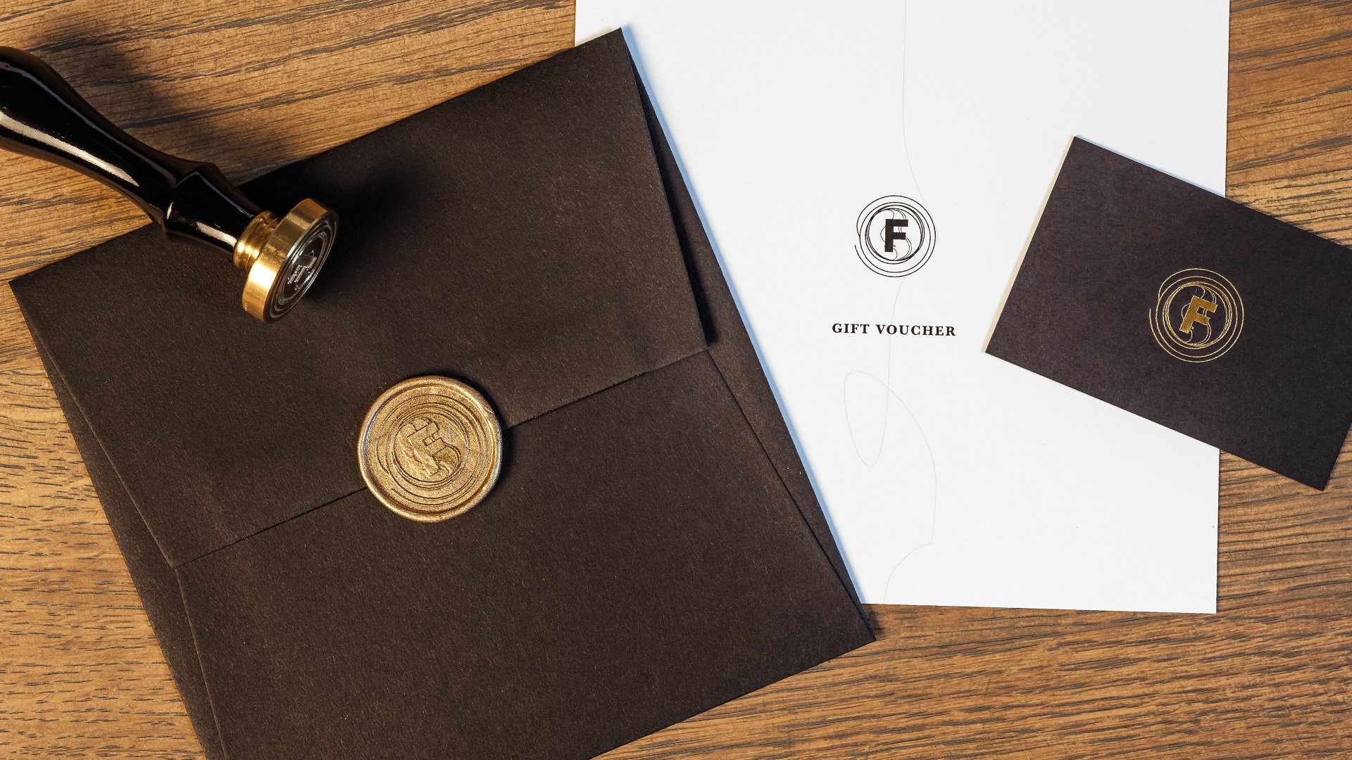
A gold thread is used as a motif to represent Dave’s journey and unfolds throughout the concept.
It travels through the Furna experience from beginning to end and can be seen on the windows, the bar design, the bespoke butter dishes, menu cover, menu pages and bill holder.


Good Noise also worked with the client to curate artwork for the restaurant to deliver a cohesive and consistent feel.
We identified local artist Sarah Arnett who had a visual style and imagery that seemed a perfect match for the space and brand.
We worked closely with the client and the artist to commission four separate bespoke pieces of artwork to be hung within the restaurant space and which also feature in various brand applications.
The artwork references Sussex garden wildlife which forms a nice connection to the inspiration for the restaurant name.


Services Included:
Brand Strategy, Naming, Brand Identity, Logo Design, Signage, Print, Menu Design, Brand Application, Brand Guidelines, Website
Photography by Paul Winch-Furness.