Safe As Milk
BRAND IDENTITY, BRIGHTON U.K.
Safe As Milk is a premium Shopify theme developer, founded in 2017 . Their themes, serve a wide range of e-commerce businesses from independent retailers to professional agencies placing them consistently in the top 20 developers by volume.
Good Noise was engaged to refresh the existing visual identity for Safe As Milk. The project scope included a logo and avatar for use across social platforms, a word mark, colour palette, typography and brand guidelines.
The brief carried a tension. Safe As Milk had earned a reputation for dependability, gaining seven years of high review scores, responsive support, and a product that consistently delivered. However, dependability alone does not distinguish a brand in a market where most competitors offer technically comparable products and share a very similar visual language.
The identity needed to hold two qualities at once: the solidity of an established, trustworthy business, and enough personality to attract design‑aware agency professionals who are selective about the brands they work alongside.
—
The brand strategy workshop with the Safe As Milk team revealed the gap between how the business operated and how it presented itself.
Two customer groups emerged: shop owners who valued reliability, and agency professionals who were design‑conscious, loyal to trusted developers, and represented the more commercially significant audience.
Most theme developers mirrored Shopify's aesthetic: functional, but impersonal. Safe As Milk could be something, Dependable, but not Dull.
The design brief pointed toward geometric forms, flat graphics, and clean lines. The principles of Dieter Rams offered a useful grounding for example: useful, honest, long-lasting
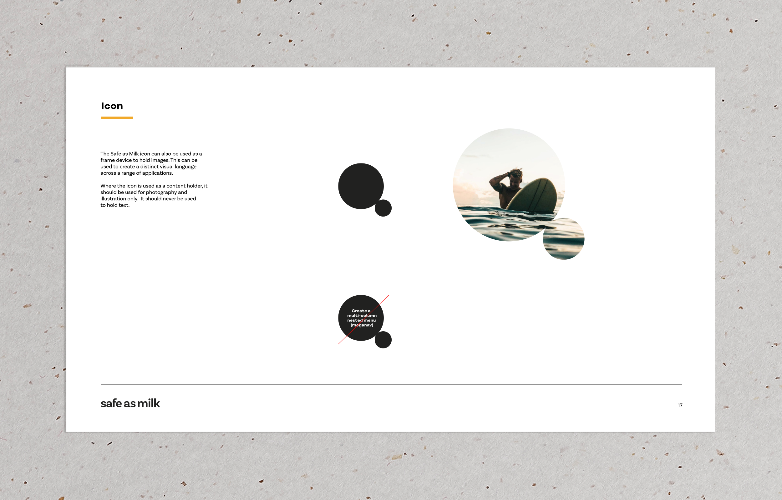
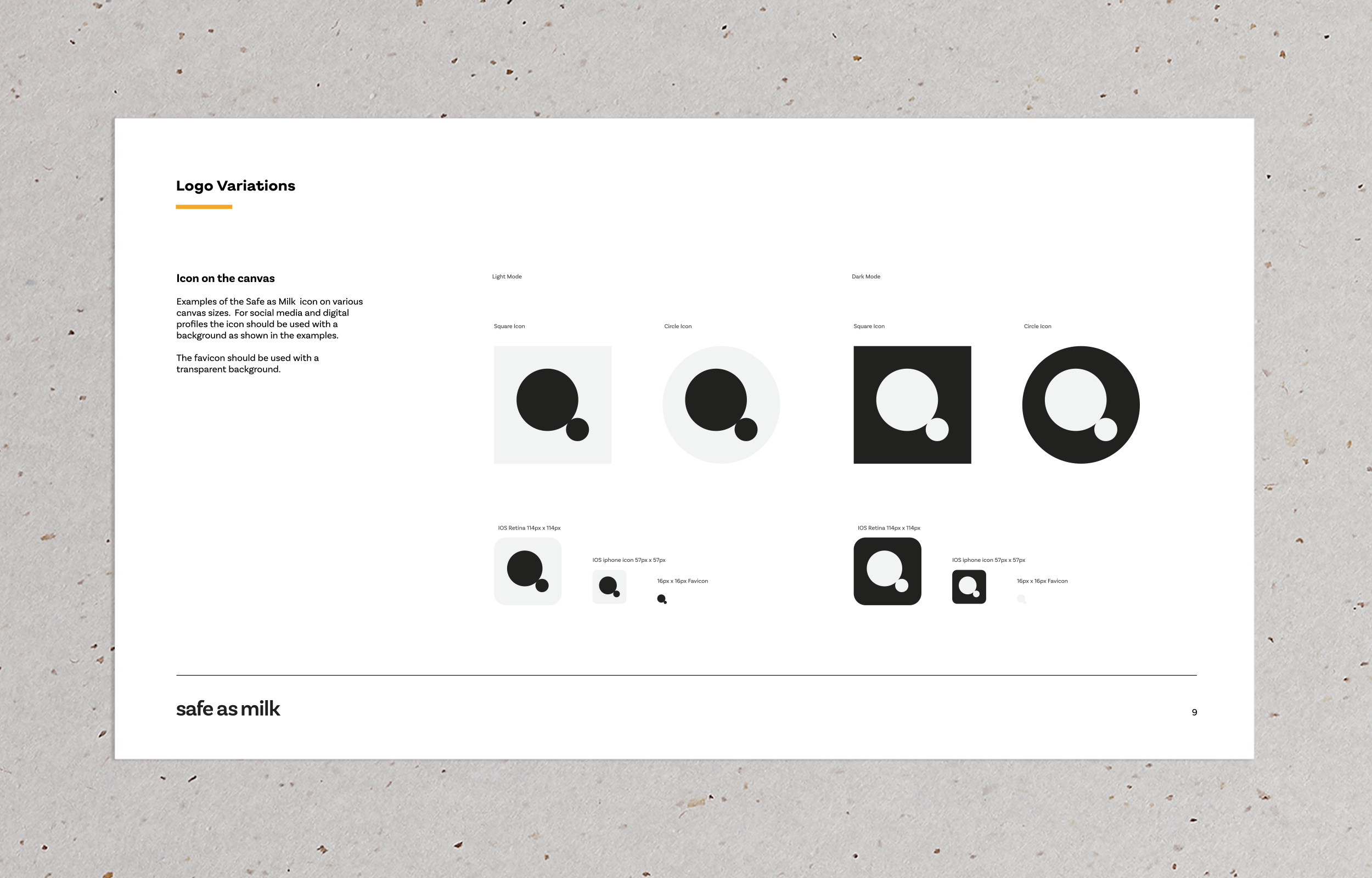
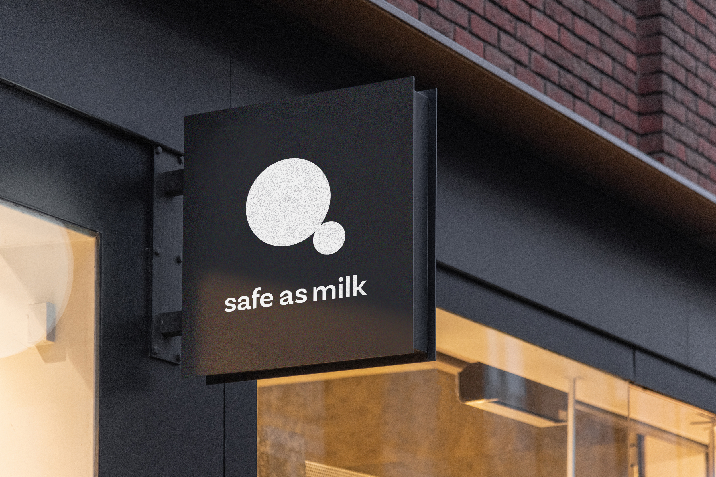
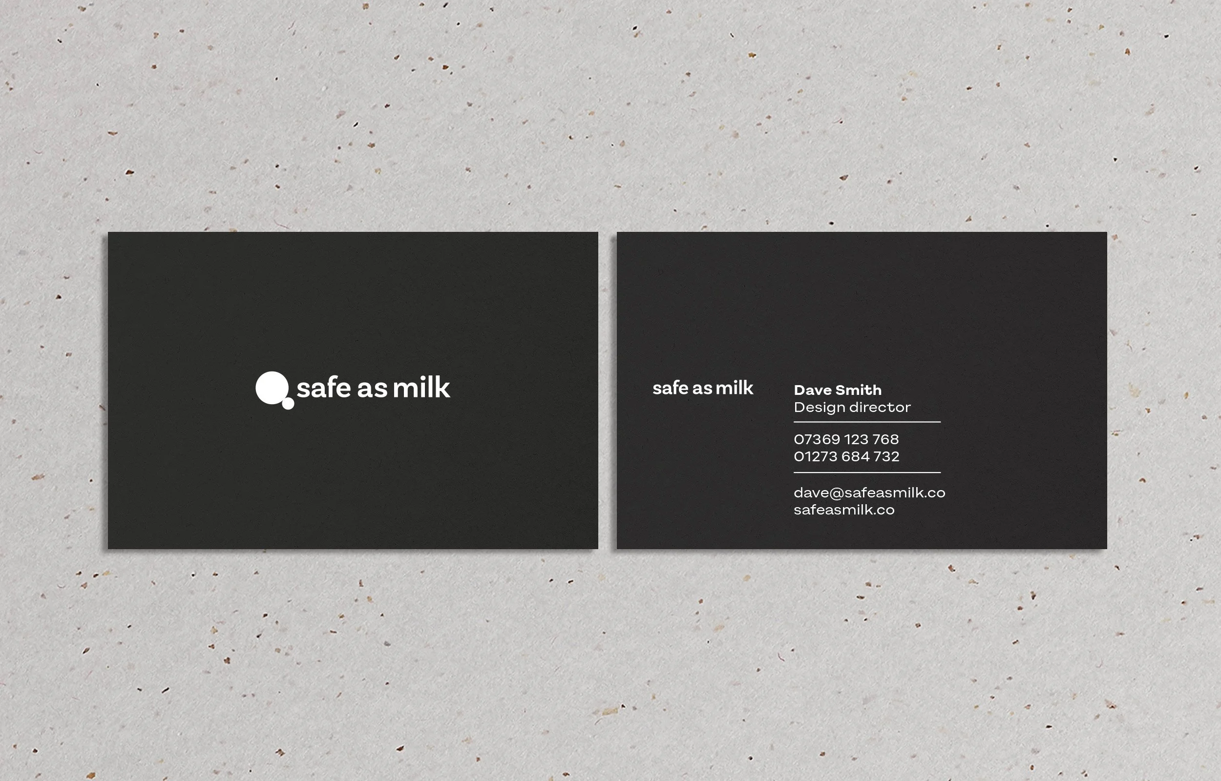
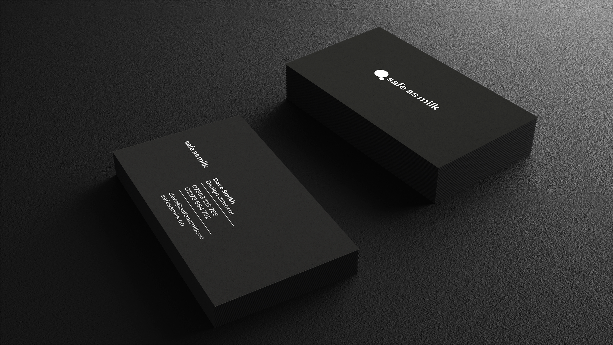
The central idea was the splash: a fluid, organic form used as the icon at the heart of the logo. Read as a thought bubble, it communicates the care and consideration the business had always put into its work, but had never made visible before.
The wordmark pairs the splash with a typeface that enacts the brand essence: solid utility and quiet personality, working in tandem.
—
Safe As Milk now has an identity that resolves the tension the brief presented: confident and professional where it needs to be, and characterful where the opportunity arises.
The brand guidelines give Safe As Milk the framework to apply all of this with confidence.