Case Study: Venue Brand Identity
BRAND IDENTITY FOR WOKING THEATRES AND CINEMA, WOKING
Translating a shared strategy into a flexible identity system for three venues, with practical tools for the teams responsible for their communications.
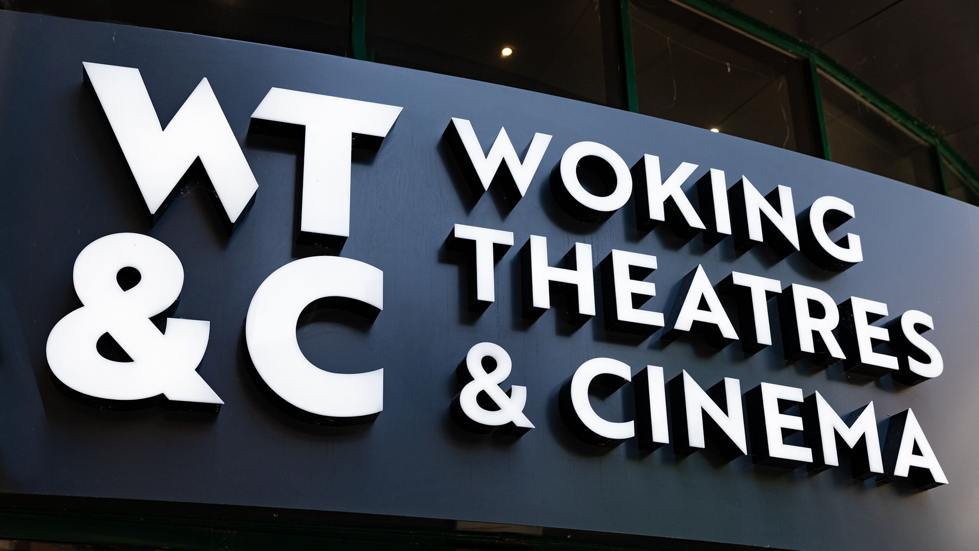
Following our brand strategy work for Woking Theatres & Cinema, Good Noise developed a connected family of identities for the destination that comprises Woking Theatre, Rhoda McGaw Theatre and Nova Cinema.
The project extended from logos, colour palettes and typography into brand guidelines, digital design guidance, social media templates, tone of voice, signage and campaign applications. Each element needed to express the strategic relationship between the venues and work within the practical demands of a busy cultural organisation.


The brief: make the strategy visible and usable
The strategy established Woking Theatres & Cinema as one destination that housed three distinct experiences. The identity needed to make that relationship apparent wherever audiences encountered it.
The existing venue identities had developed separately over time. Bringing them together required a shared visual language that could accommodate different programmes, audiences and personalities.
There were also practical requirements. The identity system needed to work on large external signs, narrow fascias, digital screens, posters, websites and small social media icons. Internal teams and external partners needed clear guidance on how to apply it.
Our task was to give the organisation a recognisable visual structure with enough flexibility for each venue to communicate confidently.
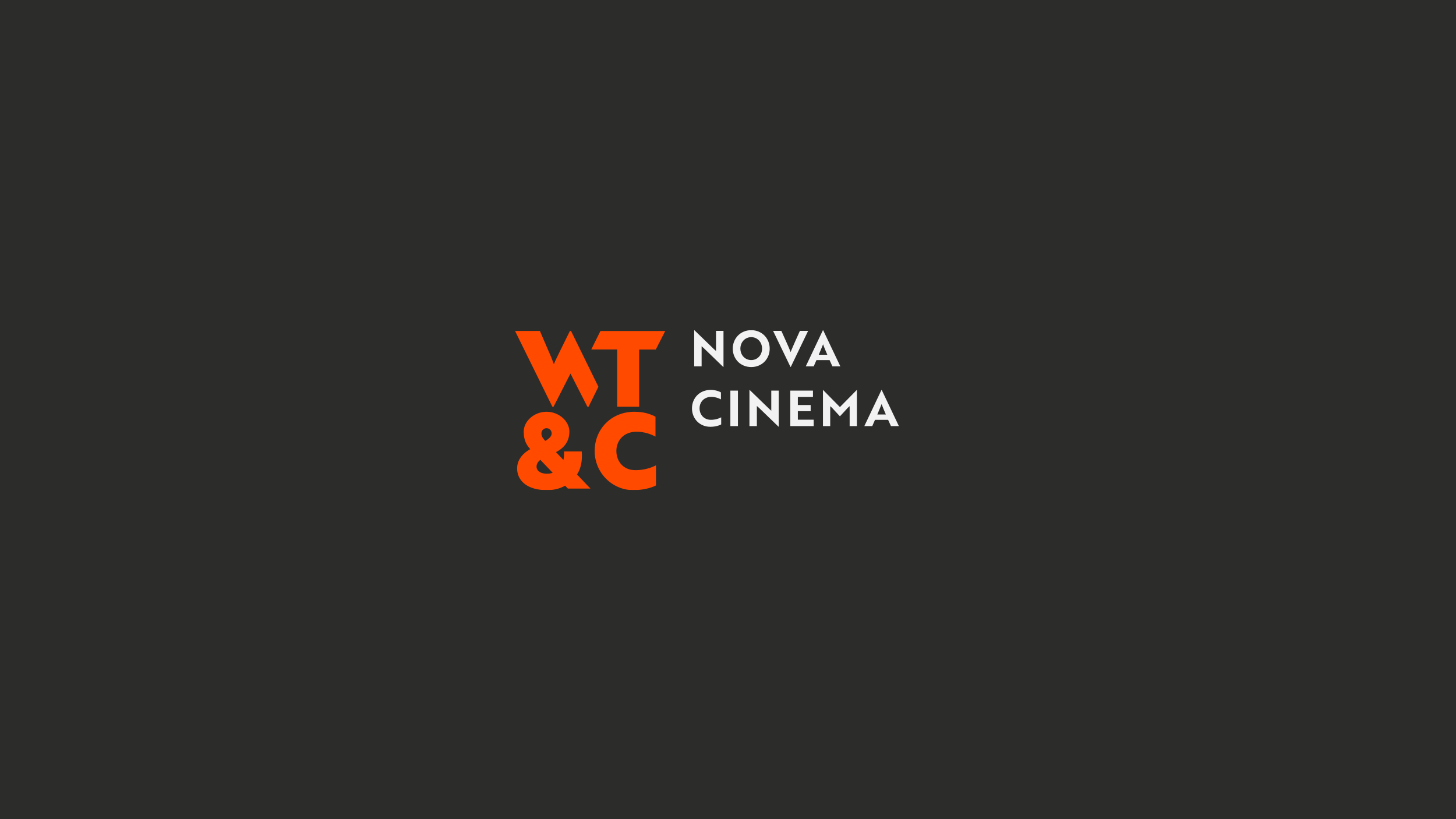
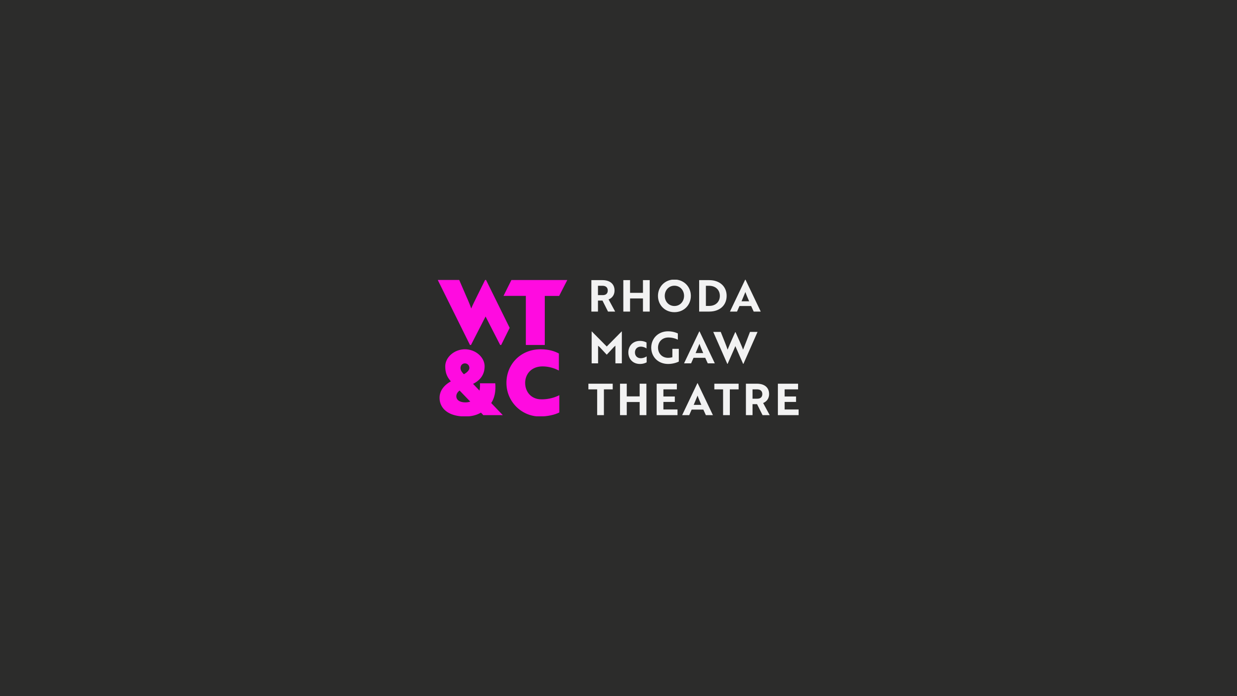
Connecting the identities through form, colour and typography
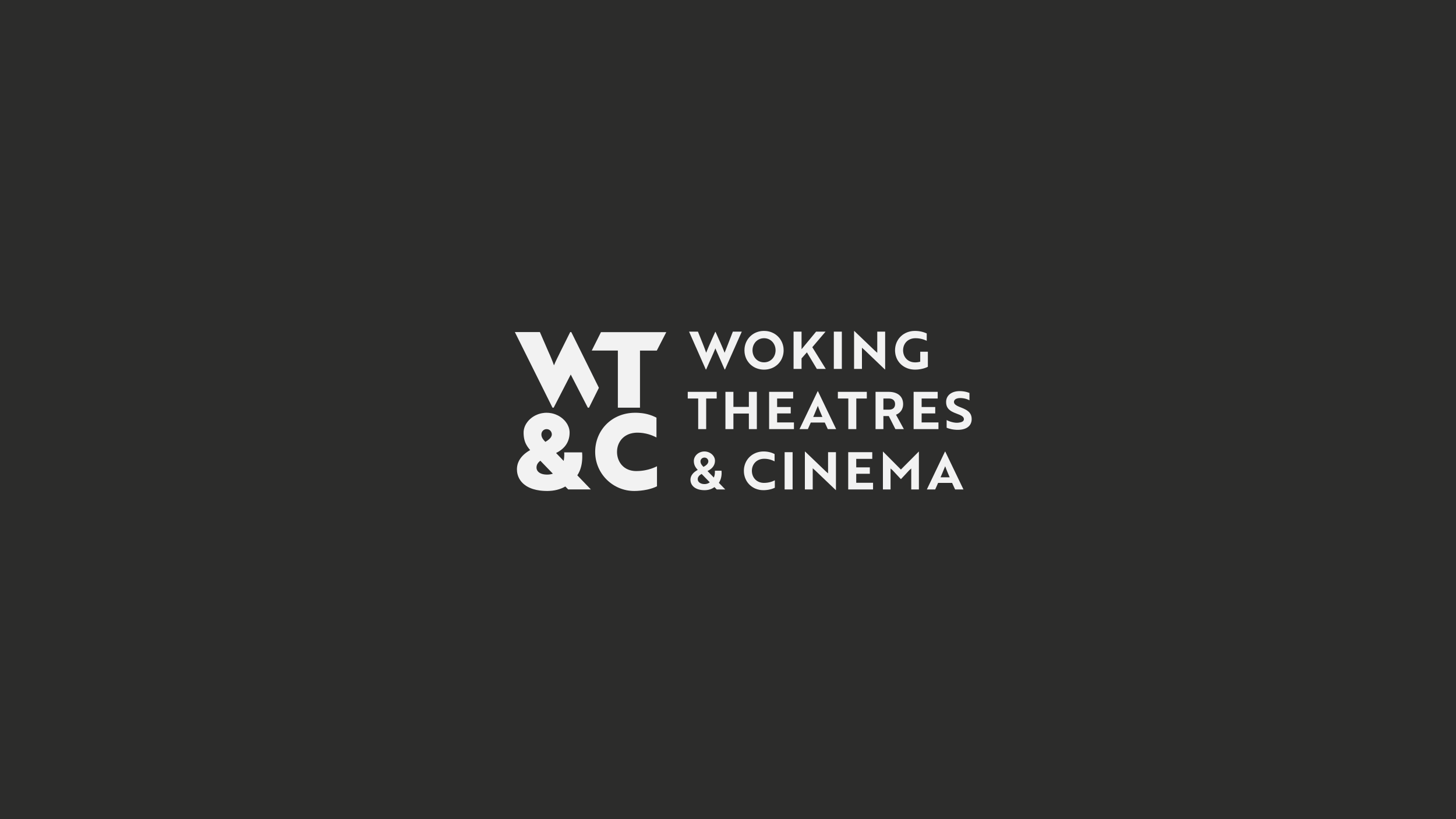
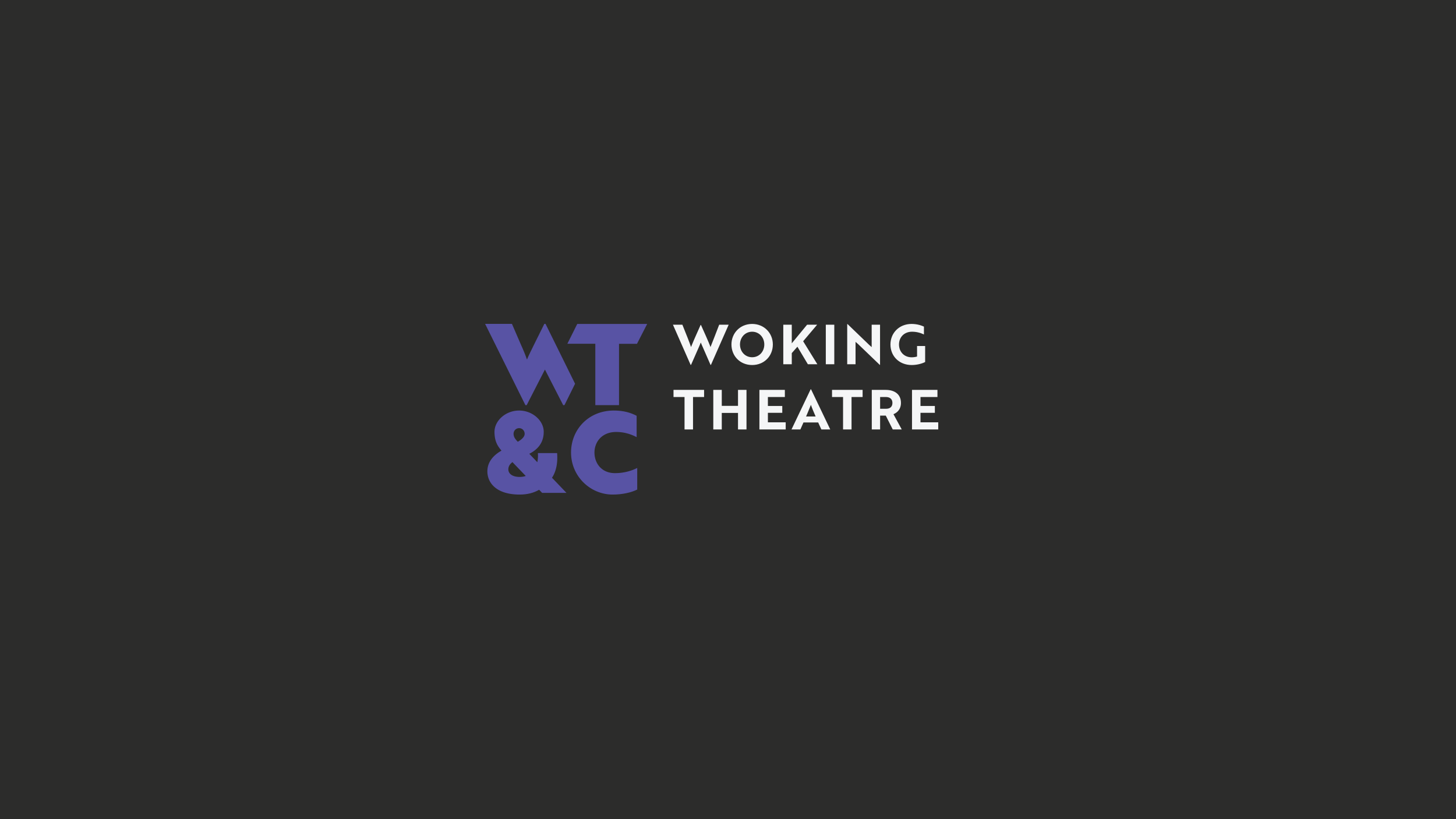
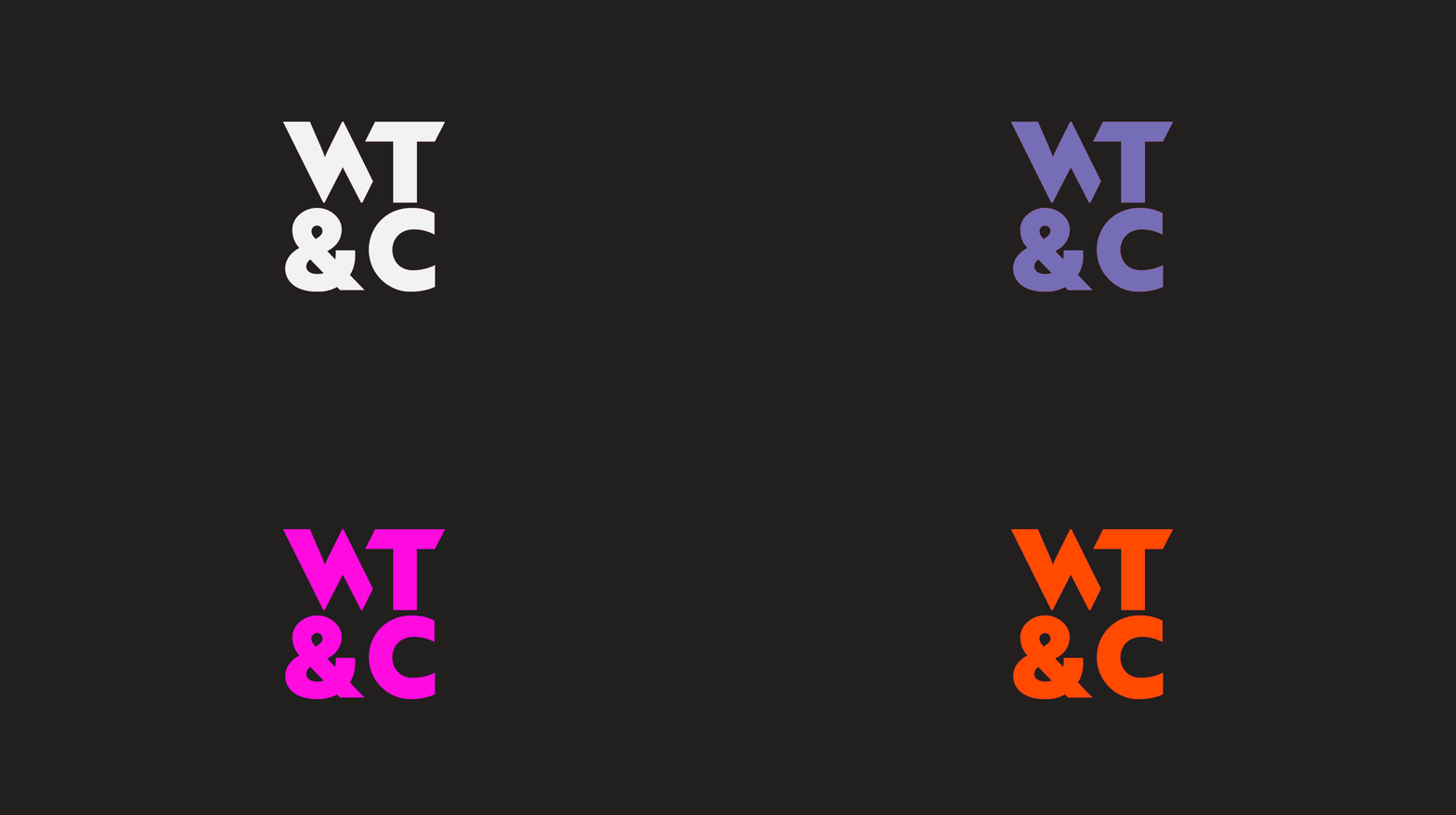
We created a family of identities linked by a shared symbol, typographic approach and logo structure.
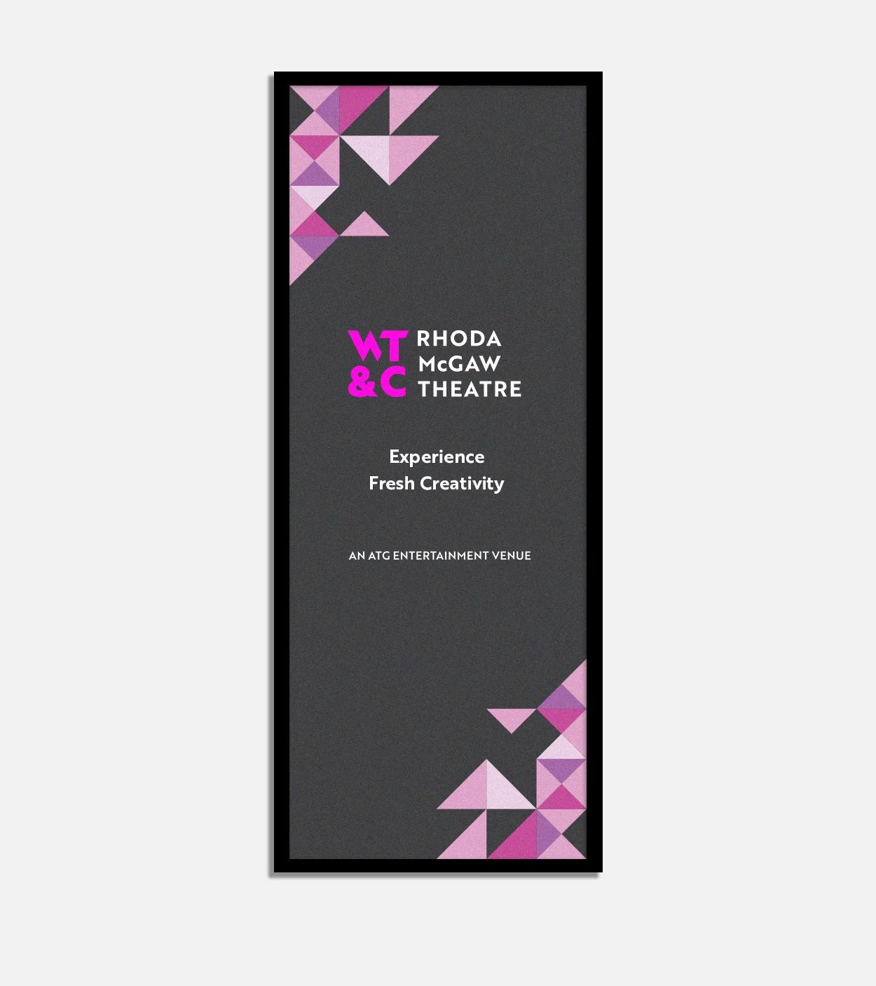
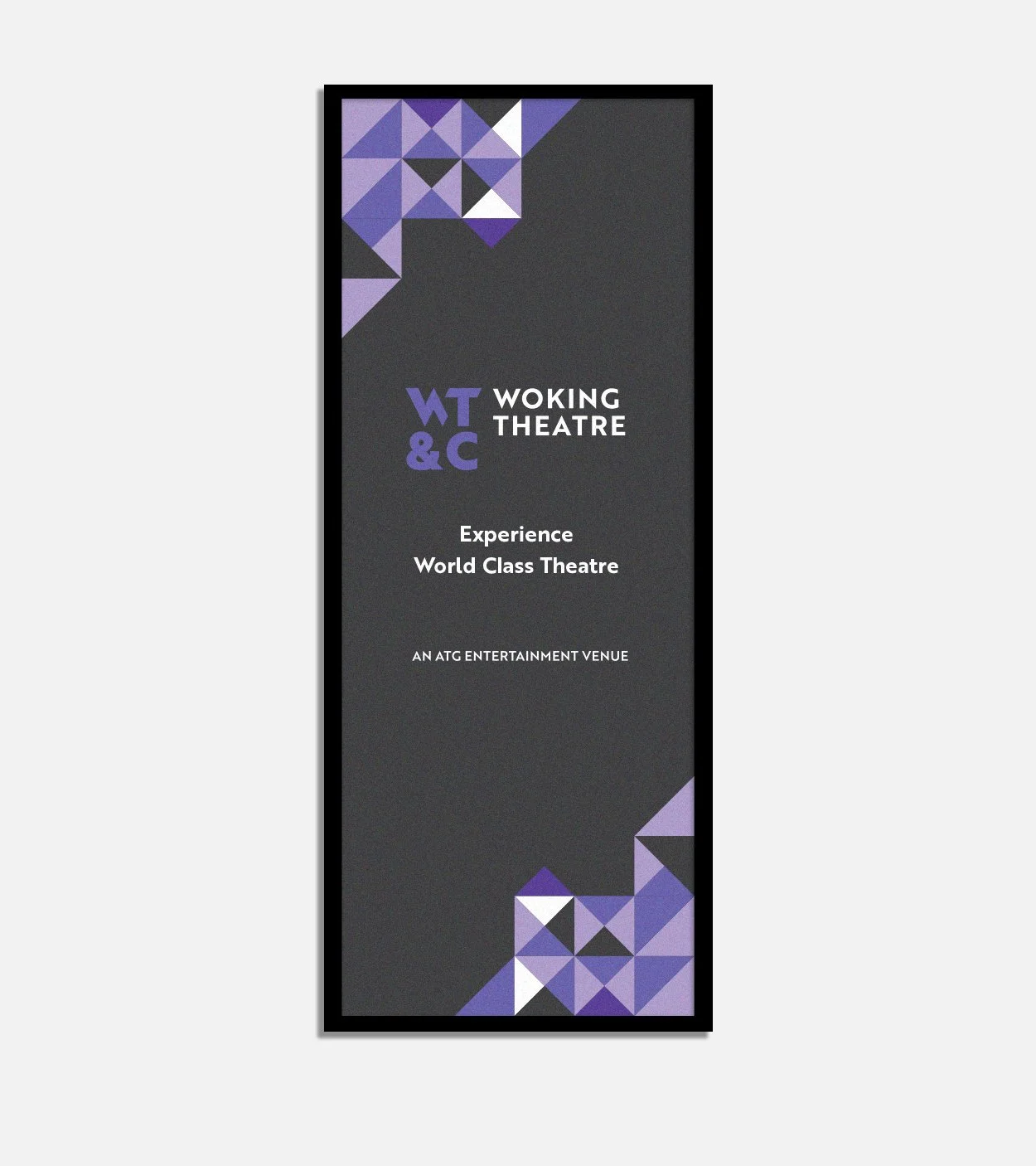
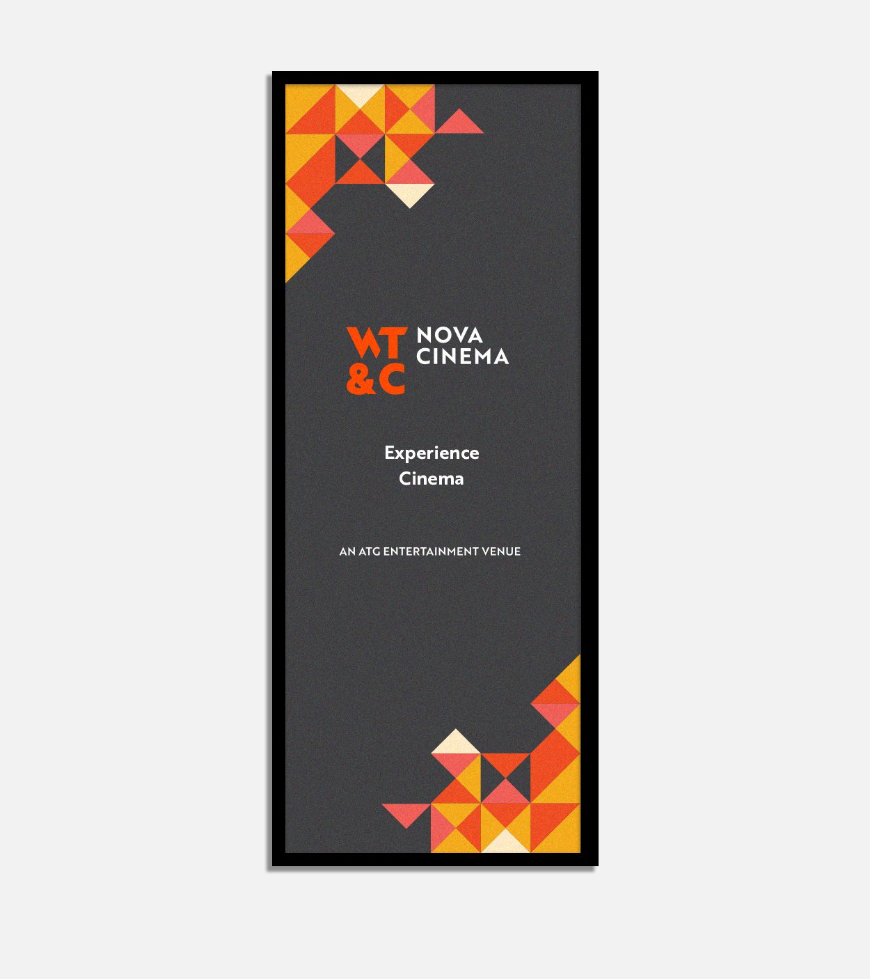
The overarching Woking Theatres & Cinema identity uses a monochrome palette. This gives the destination a neutral presence alongside the stronger colours assigned to the venues: purple for Woking Theatre, pink for Rhoda McGaw Theatre and orange for Nova Cinema.
Colour provides a clear point of distinction within the shared system. The venues can be recognised individually while their common structure makes the family relationship visible.
Brother 1816 provides a consistent typographic foundation across the identities and their applications. Defined roles for bold, regular and light weights establish a hierarchy for headings, body copy and captions, helping communications feel related across different formats.
These shared elements allow individual applications to vary while preserving a recognisable connection to the destination.

Building flexibility into the system
We developed variations for the different environments in which the identities would appear.
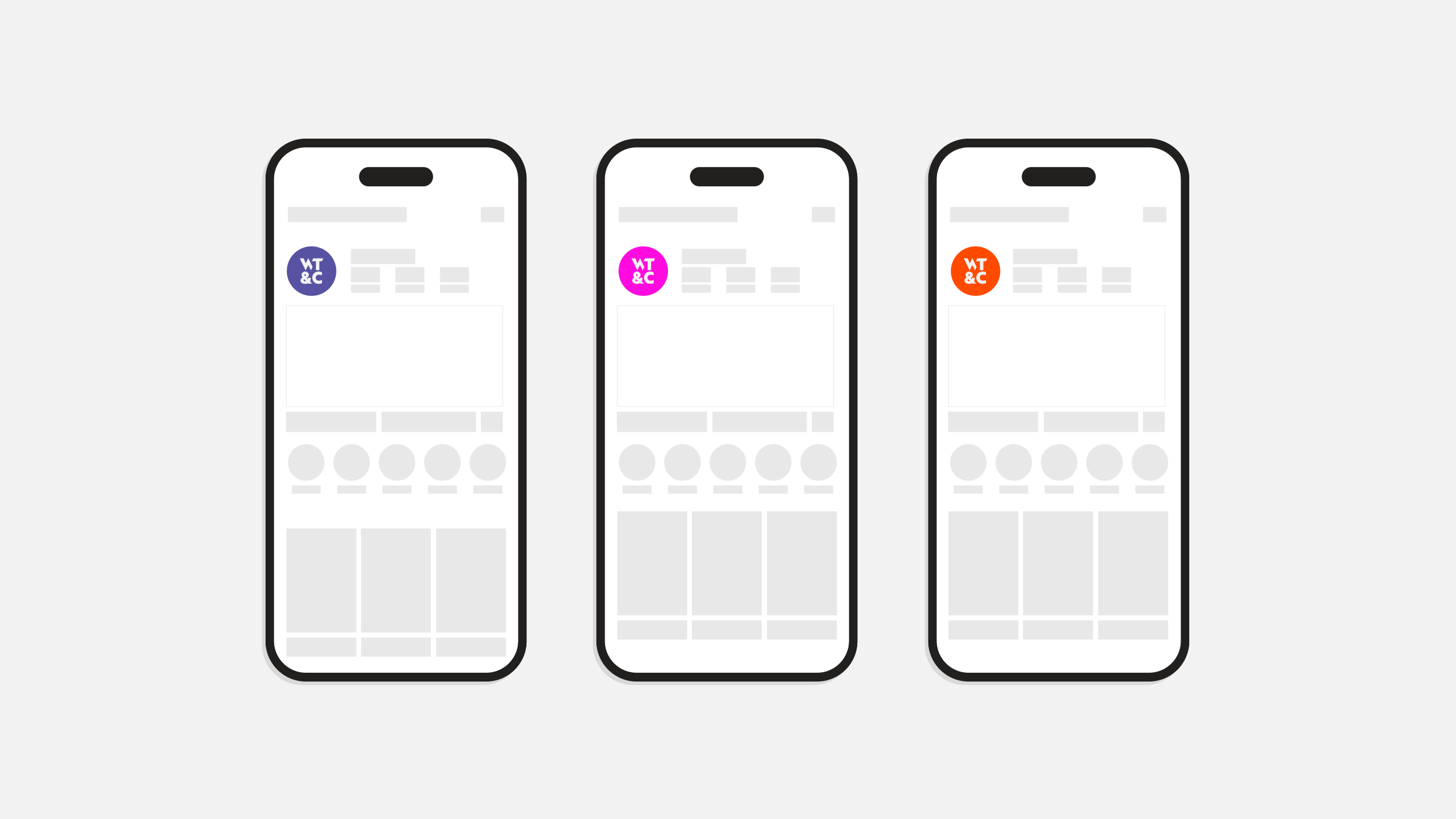
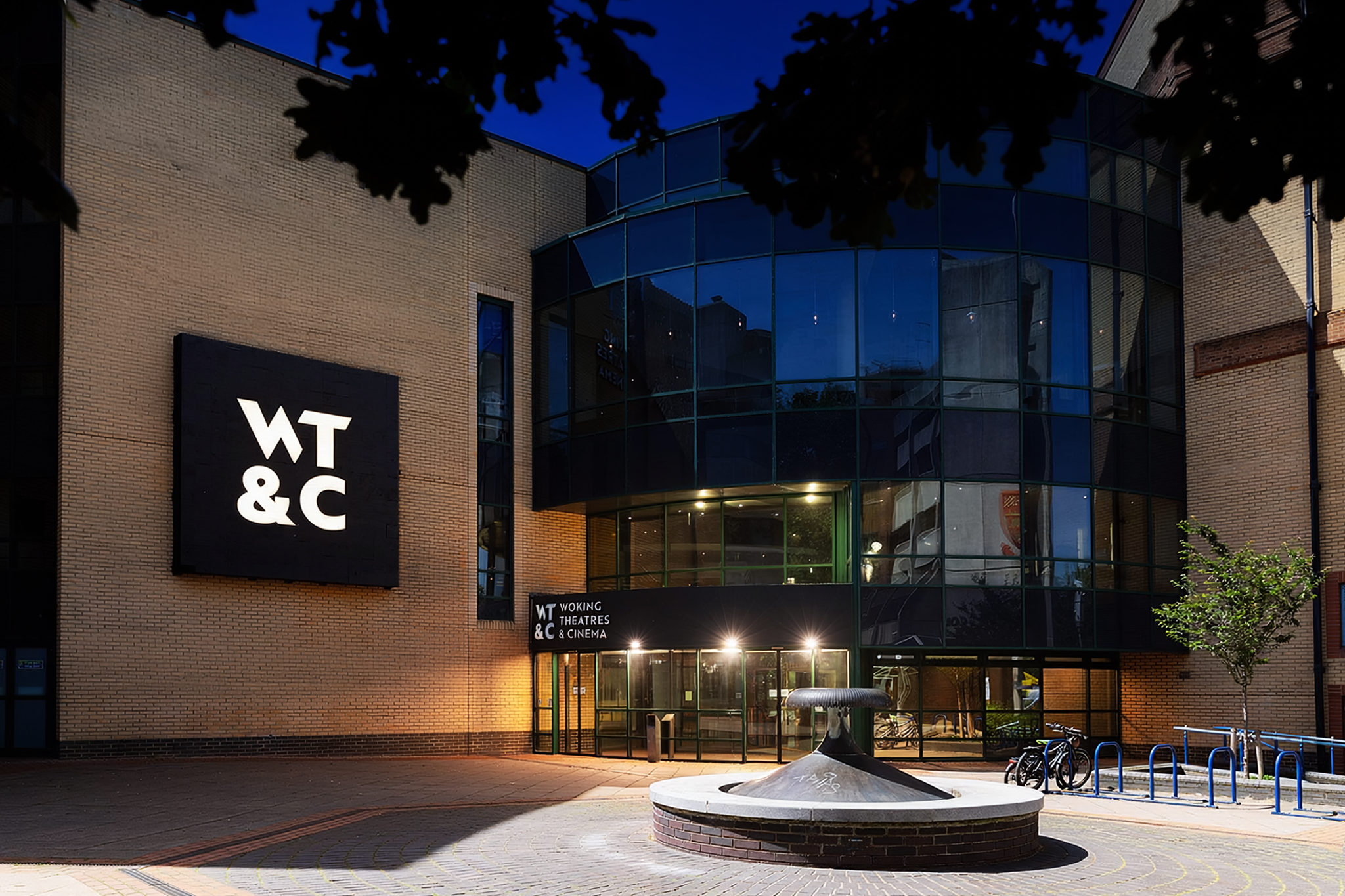
The destination identity includes a linear version for spaces with limited height, such as narrow fascias and bulkhead signs. Compact icons support smaller applications, including social profiles and web browser favicons. Dedicated signage arrangements account for the different proportions and viewing conditions of the physical environment.
Guidance covers clear space, positioning, scale, colour and the use of supplied artwork. These details give teams and suppliers a consistent starting point when adapting the brand to new formats.
The aim was to make the identity manageable over time, as new campaigns, programmes and production requirements emerged.
Giving Nova room to express its own personality
Nova needed a particular balance between belonging and individuality.
The strategy identified an opportunity to communicate a stronger passion for cinema and a more considered, independent character. Its identity therefore includes two complementary forms.
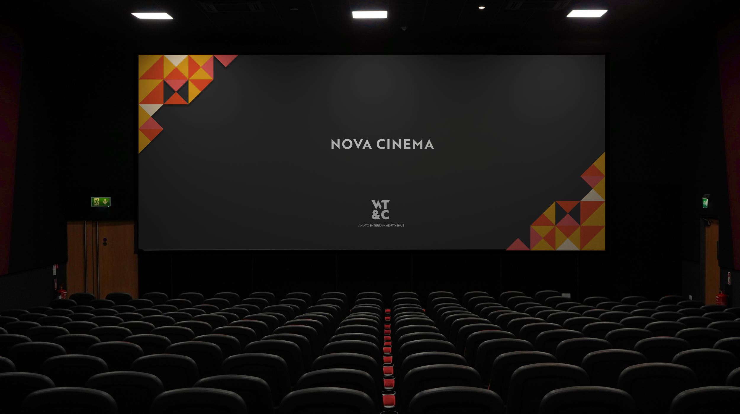
A standalone Nova Cinema logotype gives the cinema a distinctive presence in its own communications. A second logo, built around the shared WT&C structure, identifies its place within the wider destination.
The brand guidelines explain how these elements work together. Nova can lead with its own personality in a film campaign or digital communication while retaining a clear link to the destination through the accompanying WT&C identity.
This makes the brand architecture useful in everyday design decisions, with a defined role for each mark.
Translating the identity into Nova’s website
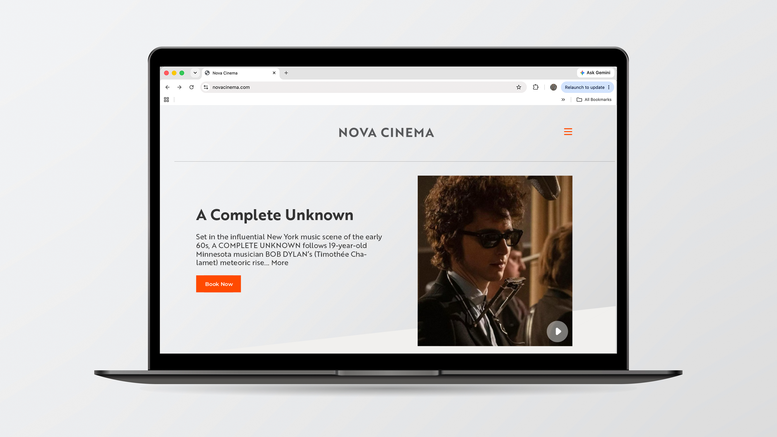
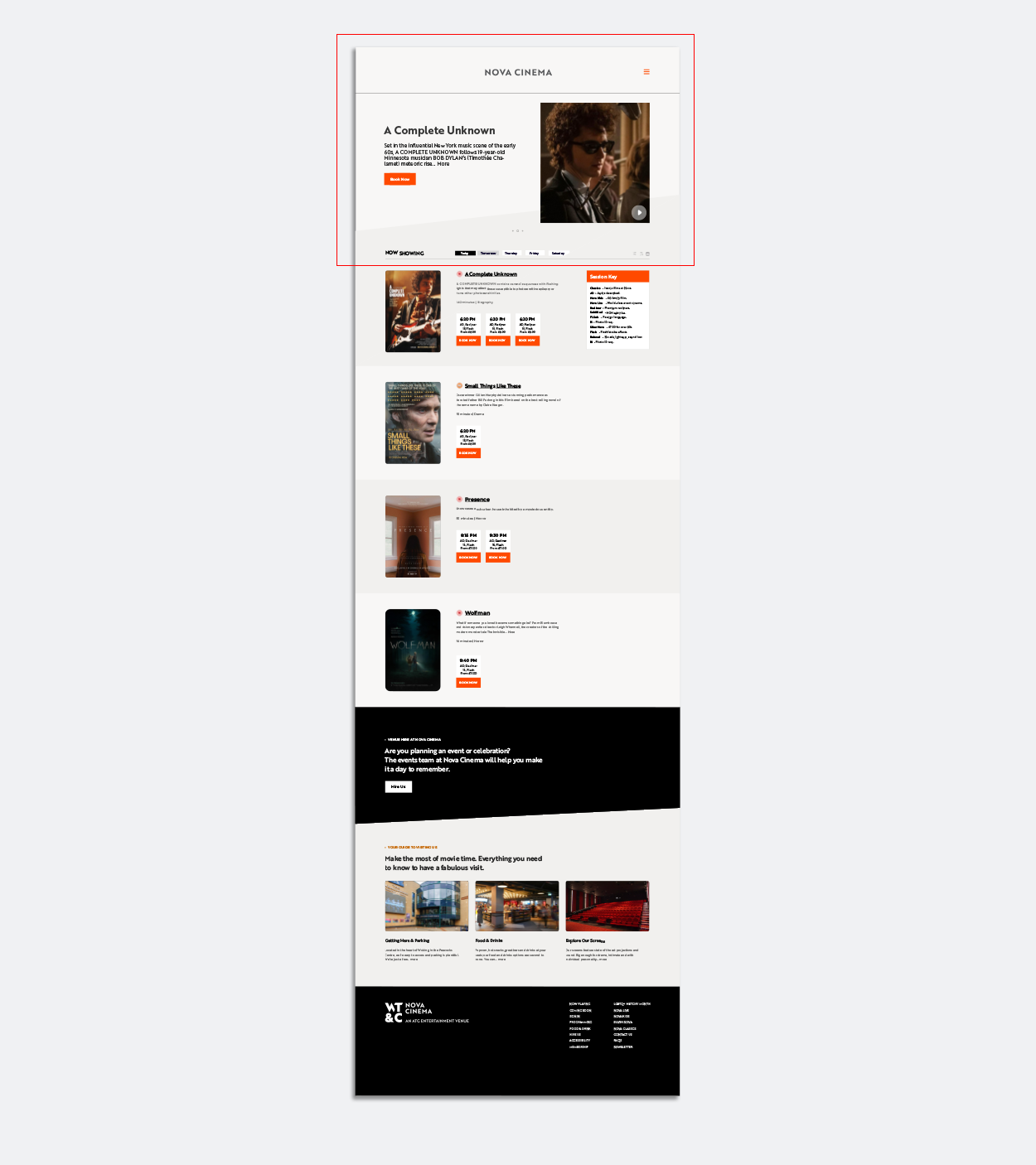
Nova’s website was an early application of the new identity and was being developed by the specialist external web team at Stunn.
We supplied a visual reference pack setting out the digital use of the logos, colour palette and typography, together with webpage visuals and application guidance.
This connected the identity to the practical components of the website. It showed how Nova’s own logotype and its WT&C relationship could be expressed together, and how type and colour should establish a consistent visual hierarchy.
Our role was to provide brand direction and design guidance for the website team, helping the digital presentation carry the same character as the wider identity.
Making everyday communications easier to produce
A cinema’s communications change constantly. New releases, screenings, membership offers and audience messages all need to work within the same brand structure.
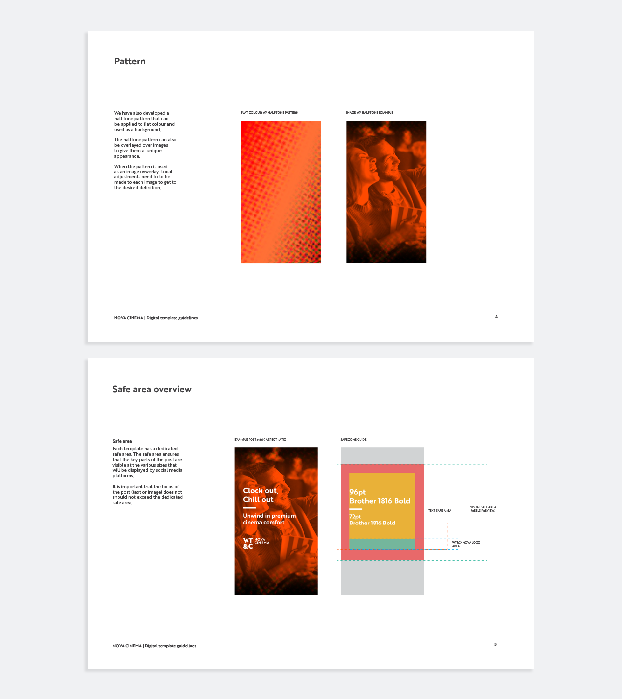
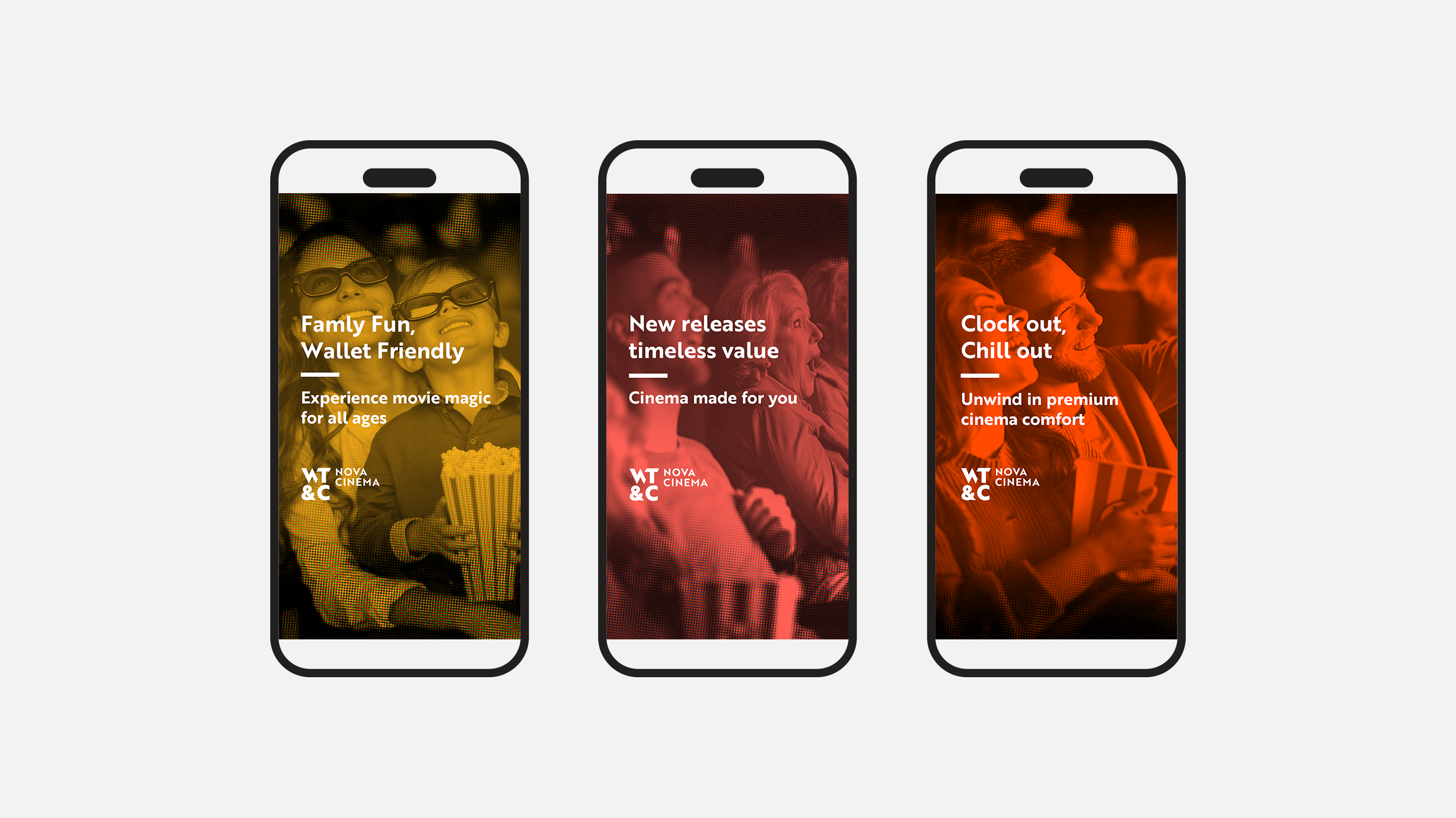
We developed Nova’s digital templates across landscape, portrait, square and vertical formats, with examples addressing young professionals, families and older audiences. The supplied templates also covered website banners, membership and gift vouchers.
Each format includes strict guidelines to keep important text and imagery visible when content is cropped or displayed differently across social platforms.
A halftone treatment overlaid on photography extends the visual language and gives the WT&C team another recognisable brand asset to use across varied content.
Together, the templates and guidance provide a repeatable approach to image placement, typography and branding, while allowing communications to respond to different films and audiences.
Giving Nova a voice consistent with its positioning
The way Nova spoke needed to support the same character as its visual identity.
We developed a social media style bible and a shorter tone-of-voice reference guide around the idea of Nova as a confident cultural host: knowledgeable about film, warm towards its audience and considered in its recommendations.
The guidance translates that personality into practical writing decisions. Arthouse and repertory films can be introduced with a calm, curatorial tone. Mainstream releases allow warmer enthusiasm, while family screenings and events can adopt a lighter register.
It also covers calls to action, community responses, food and drink descriptions and everyday language. The principle “We don’t persuade. We curate.” gives the team a concise reference for how to express confidence and judgement.
This connects the strategic ambition for Nova with the communications audiences encounter between visits.
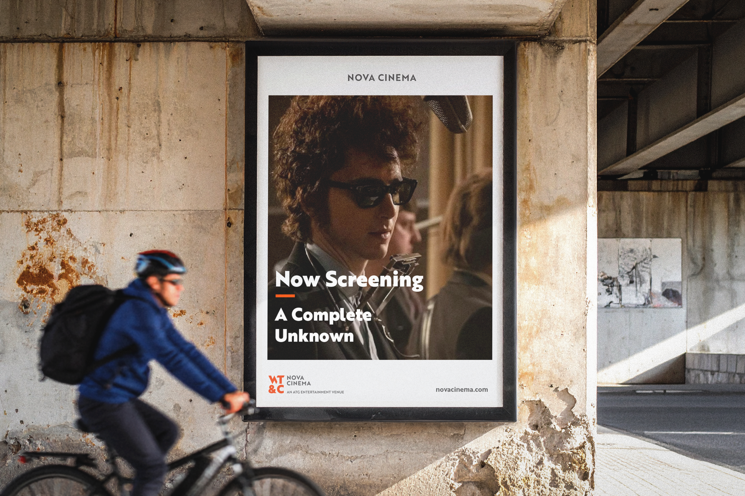
Extending the identity into the destination
The physical environment offered opportunities to introduce the destination, distinguish its venues and communicate more of what was available.
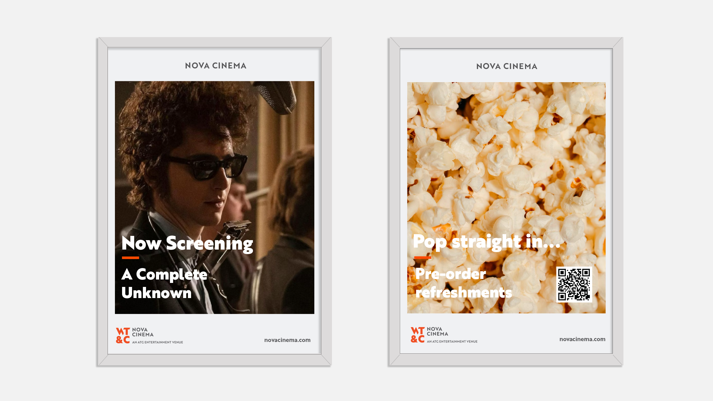
Our application work included signage, promotional poster templates, social media assets, house messaging templates and animated content. We also developed environmental and campaign concepts applied across windows, digital screens, cinema lightboxes and pillars within the venues, as well as external locations including buses, bus stops and shopping centres
The shared destination proposition and individual venue messages gave this work a clear hierarchy. An application could introduce Woking Theatres & Cinema as a whole or focus on a particular reason to visit.
Placemaking concepts explored how larger graphic treatments and messaging could bring the brand into spaces audiences move through. These extended the identity beyond venue identification into a more visible expression of the destination’s cultural offer.
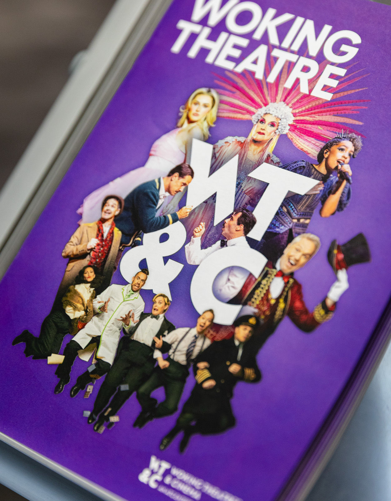
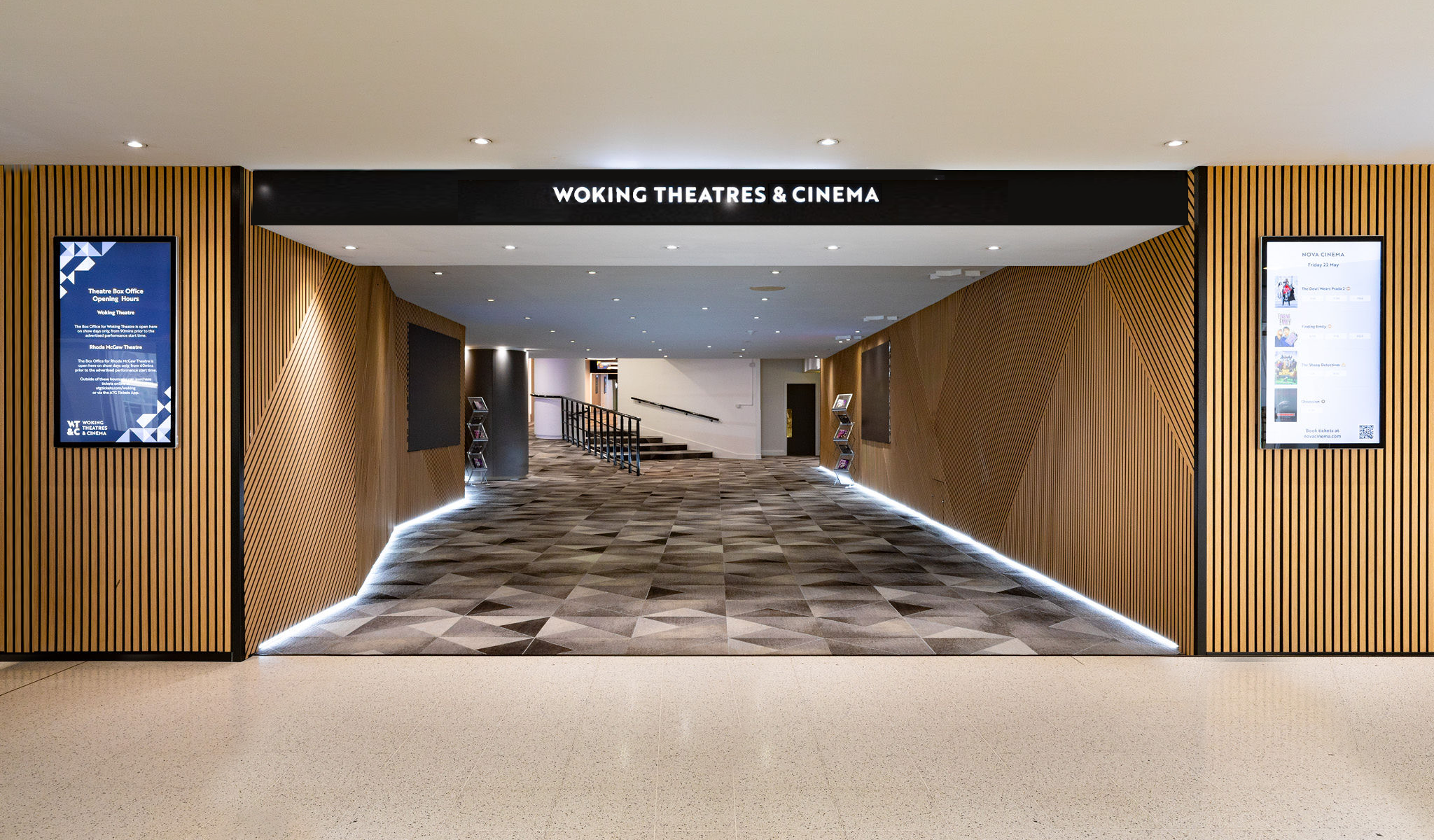
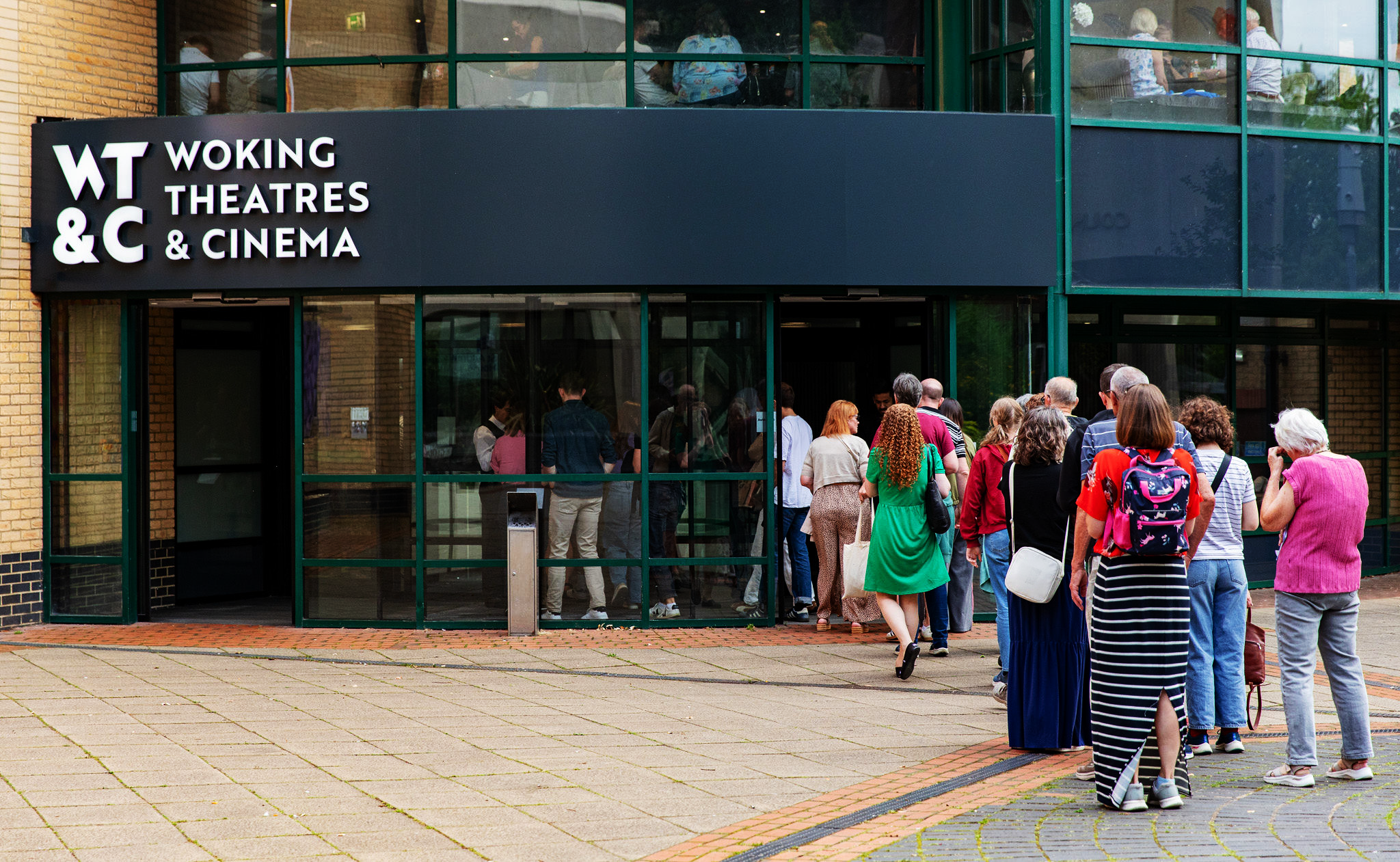
The outcome: a connected identity with practical tools behind it
The new identity launched in April 2026, with further application and campaign development extending the system.
Woking Theatres & Cinema gained a recognisable destination identity, while each venue retained a distinct visual presence. Guidelines established the shared rules; digital references supported external delivery; and templates and tone-of-voice guidance helped translate the brand into everyday communications.
The project demonstrates how a brand strategy can inform decisions at every scale, from the relationship between venue logos to the wording of a social post.
For the organisation, the result is a practical foundation for communicating three different cultural experiences as part of one connected destination.
“This is a hugely exciting moment for us and for Woking. Bringing our venues together as Woking Theatres & Cinema gives us a clearer identity and reflects the important role we play at the heart of the community.”
Laura McMillan, Venue Director.
Planning a theatre, cinema or venue rebrand?
We work with cultural organisations to connect brand strategy, visual identity and the way audiences encounter a venue.
Whether you are bringing several brands together or developing an established identity, we can help create a system that expresses your character and works for the people using it.
Talk to us about your branding project.
Services: Brand identity, logo design, visual language, brand guidelines, digital design guidance, social media templates, tone of voice, campaign design, animation, signage and environmental graphics