Restaurant Brand Refresh Case Study
RESTAURANT BRAND REFRESH: LASDUN RESTAURANT AT THE NATIONAL THEATRE
Repositioning and refreshing a restaurant brand within one of London’s most distinctive cultural destinations.
Lasdun is a modern British restaurant situated at the heart of the National Theatre on London’s South Bank. Operated by the team behind the acclaimed Marksman Pub in Hackney, it brings together a distinctive architectural setting, high-quality British cooking and the energy of one of the country’s leading cultural venues.
Lasdun had developed a strong pre-theatre audience, but the restaurant wanted to broaden its appeal. The ambition was to attract more guests after 7pm and establish Lasdun as a dining destination in its own right, while continuing to welcome its existing theatre-going customers.
Good Noise was appointed to clarify the restaurant’s positioning and refresh its visual identity. Our work included brand research and strategy, visual identity development, illustration, menu design, print applications and comprehensive brand guidelines.

The challenge: becoming a destination in its own right
Lasdun occupies an exceptional location, but that location also presents challenges.
The restaurant sits on the upper ground floor of the National Theatre rather than having a direct street entrance. It was busy during the pre-theatre period but quieter later in the evening, with limited passing trade and wayfinding complicated by the nature of the building.
The initial launch had happened quickly, without the opportunity to develop detailed positioning. Although Lasdun had a respected food offer, an impressive interior and a close relationship with the National Theatre, its brand did not yet communicate a sufficiently distinctive reason to visit independently of a performance.
The project therefore needed to achieve several things:
Broaden Lasdun’s appeal beyond its established pre-theatre audience
Attract discerning diners looking for an evening restaurant or bar destination
Retain the restaurant’s quality and character while making it feel more inclusive and approachable
Build a stronger connection between the brand, its food and its iconic setting
Create greater consistency across menus and communications
Give the internal team and external partners a practical brand system to work with
The answer was not to separate the restaurant from the National Theatre, but to make more of the qualities that connected them: creativity, cultural relevance, distinctive design and attention to detail.

Defining the audience
We began by reviewing Lasdun’s existing brand and communications, researching the competitive landscape and working with senior members of the client team to understand the restaurant’s ambitions.
The restaurant needed to continue serving theatre audiences while building a stronger relationship with people who might visit whether or not they were attending a performance.
We defined this growth audience through attitudes rather than age alone. They were culturally engaged, interested in food, art, fashion and design, and willing to pay for quality when they could see the value behind it. Eating and drinking out formed part of their everyday lives, rather than being reserved for special occasions.
They also valued places with a story. They wanted to discover restaurants they could recommend to friends and return to regularly. For this audience, the details mattered: food, service, atmosphere, language and visual presentation all contributed to whether a venue felt relevant and worth choosing.
This gave the project a clear strategic focus: Lasdun needed to feel refined without becoming formal, contemporary without chasing trends, and culturally connected without relying solely on its location.
Creating a clear position
The strategy brought together Lasdun’s strongest reasons to visit:
Modern British cooking
A menu created by Tom Harris and Jon Rotheram of the Marksman
Signature dishes and drinks, including pies and the Lasdun Martini
A design-led interior
Live jazz events
A distinctive position within the National Theatre
One of London’s most recognisable examples of Brutalist architecture
The restaurant’s intended personality combined warmth, playfulness and vibrancy with a more established sense of refinement and care. It needed to feel characterful and design-focused, but never stuffy, impersonal or overly formal.
These qualities were distilled into the brand idea:
Dining by Design
The idea connected three important parts of the offer: considered British cooking, attentive hospitality and the architecture of the National Theatre. It also provided a useful reference point for future decisions, helping the team assess whether communications and customer touchpoints felt consistent with the desired experience.


Refreshing rather than replacing the identity
Lasdun already had an established name and core logo. The most appropriate approach was therefore to build a stronger visual system around the existing identity rather than replace it unnecessarily.
We introduced more warmth, colour and personality while preserving the restaurant’s recognisable character. The refreshed system needed to feel at home within the National Theatre, but also give Lasdun enough individuality to communicate as a restaurant and bar in its own right.
This evolutionary approach allowed the brand to move forward without discarding existing recognition. It also reflected an important principle of our work: a brand refresh should respond to the actual commercial and communication problem, rather than defaulting to complete reinvention.
Drawing inspiration from the National Theatre
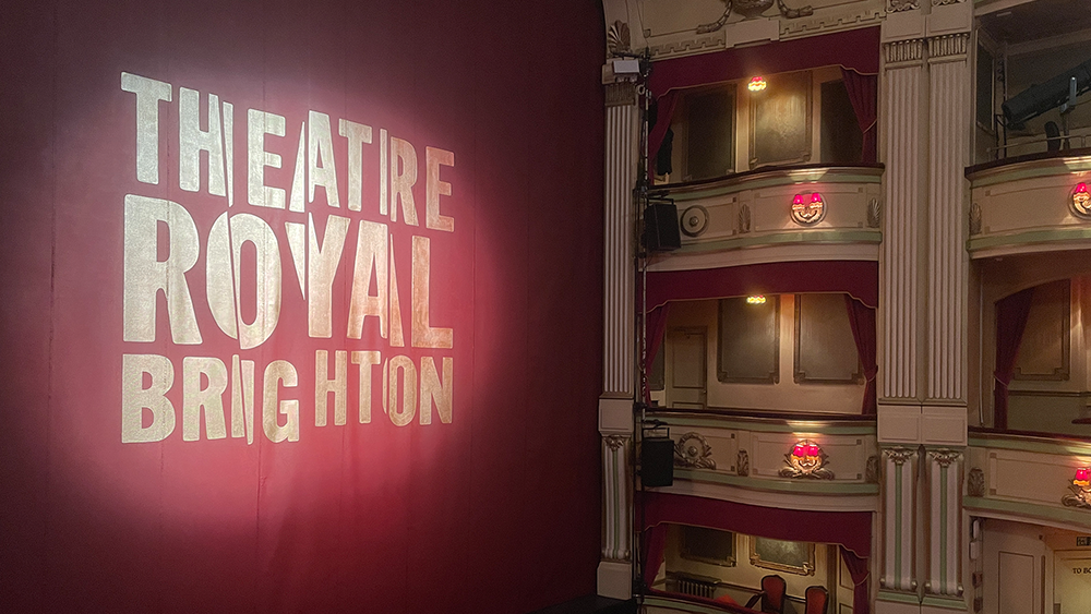
Lasdun takes its name from Sir Denys Lasdun, the architect behind the National Theatre. The building is central to the restaurant’s story, so we looked closely at how its forms and details could inform the visual identity.
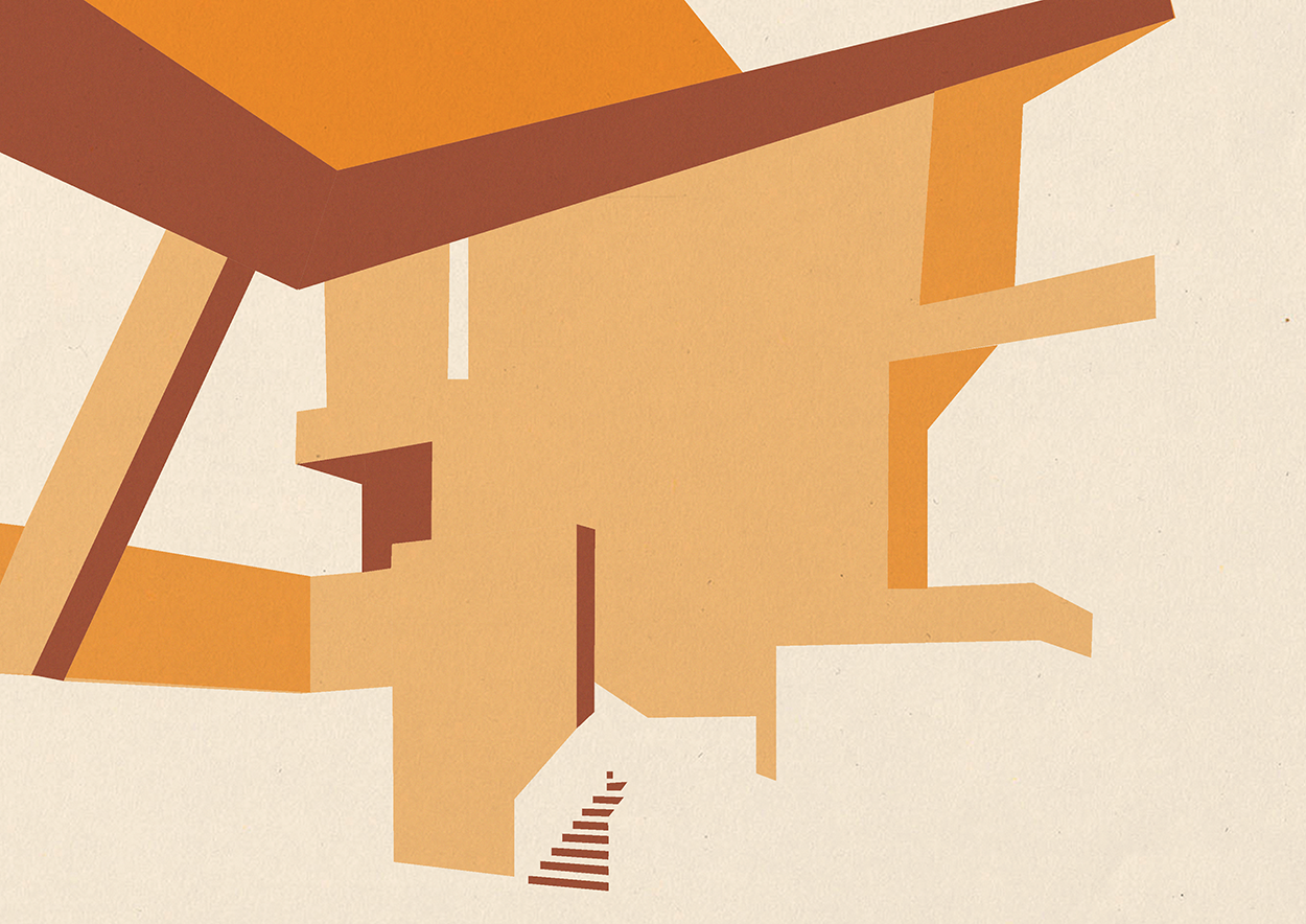
We created a simplified architectural illustration of the National Theatre that could be cropped and applied flexibly across menus and other communications. This gave the brand a direct visual connection to its setting without relying on conventional photographs of the building.
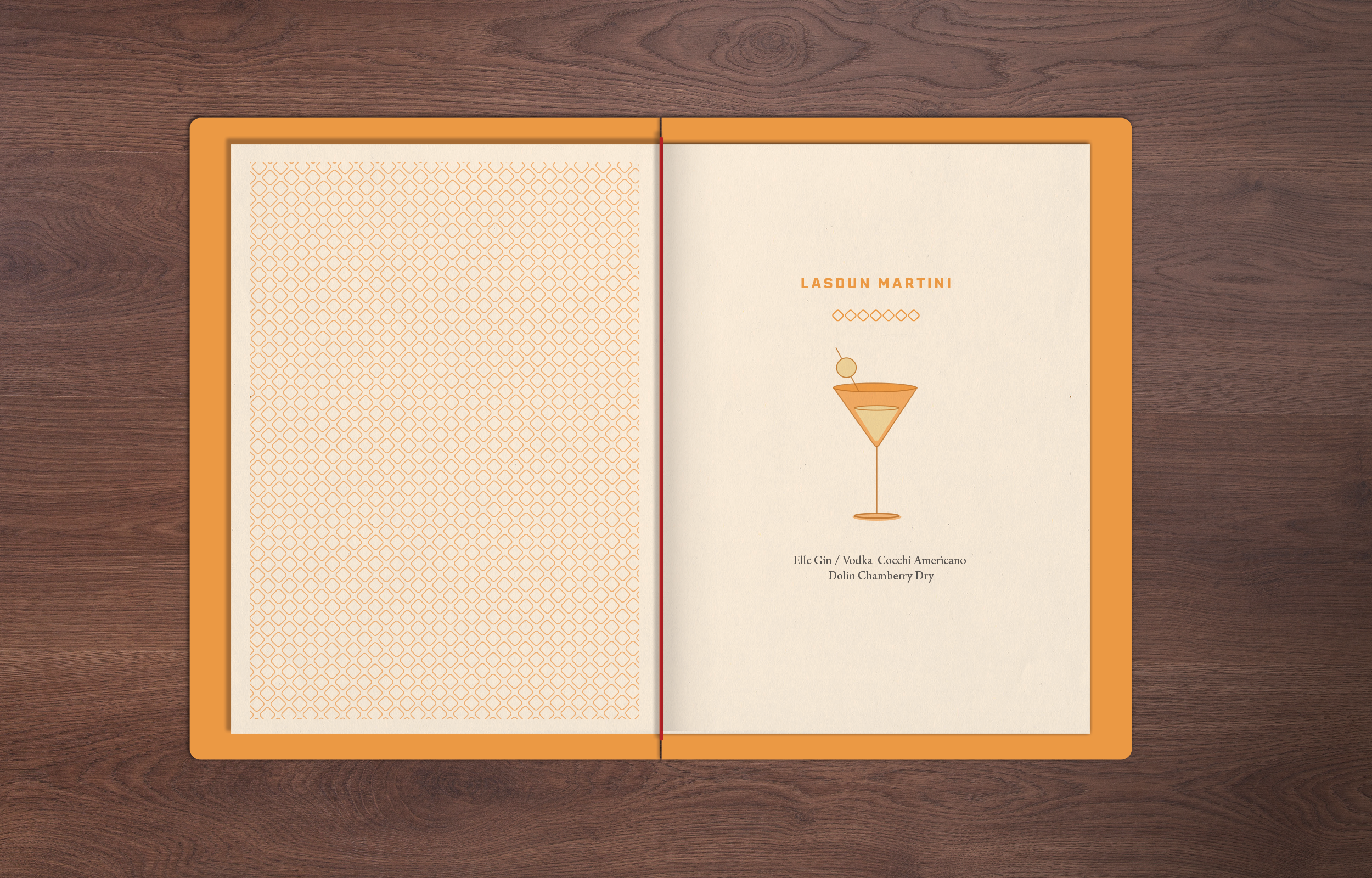
A geometric border pattern drew further inspiration from details within the restaurant and its surrounding architecture. Used alongside the illustration, it provided an additional graphic element that could help organise information and bring greater consistency to different applications.
The colour palette combines warm orange and soft neutral shades with dark charcoal. The brighter colours introduce energy and approachability, while the darker tones retain the sense of refinement appropriate to the food, interior and setting.
Typography was selected to balance personality and usability. A bold contemporary typeface gives headings a clear visual presence, while a more traditional serif supports menus and longer-form information. Together, they express a link between contemporary culture and classic design.

Making the menu part of the brand experience
The menu suite was one of the most important applications of the refreshed identity.
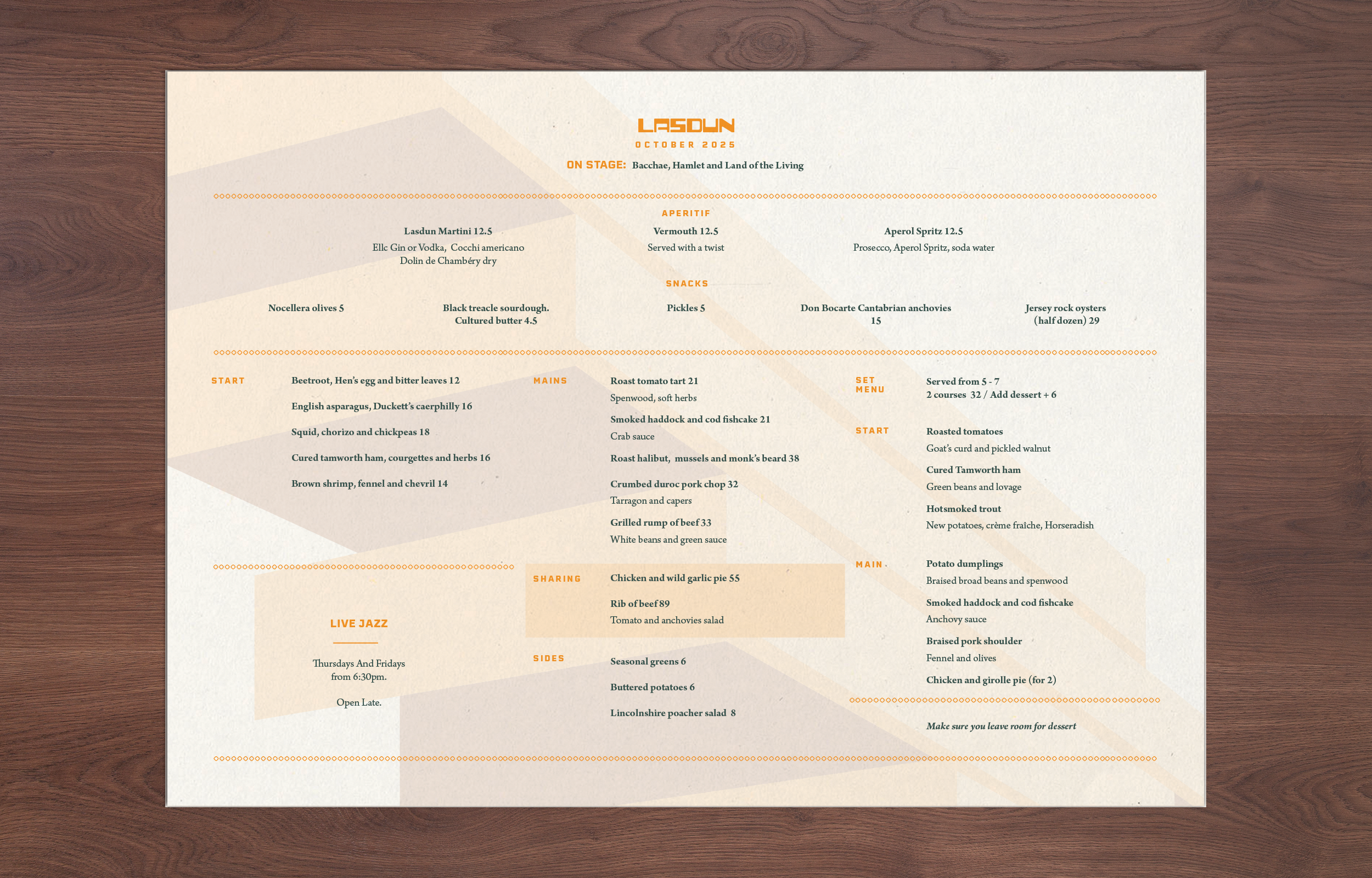
Lasdun needed to communicate several different offers, including à la carte dining, pre-theatre menus, drinks and desserts. These materials needed to be clear and practical in service while expressing the quality and character of the restaurant.
We developed a coordinated menu system using the new typography, colour palette, illustration and border pattern. Clearer hierarchy made the information easier to navigate, while consistent layouts helped the different menus feel like part of one connected experience.
The menus were treated as more than functional lists of dishes. They became an important expression of Lasdun’s position: warm, characterful, design-focused and attentive to detail.

Creating a system for consistent delivery
A successful identity needs to remain coherent after the initial design work is complete.
We created a comprehensive set of brand guidelines covering:
Core logo use and variations
Colour references
Typography and hierarchy
Use of the National Theatre illustration and patterns
Menu layouts
Examples of brand applications
The guidelines provide the Lasdun team and its external partners with a shared reference for producing new communications. This reduces uncertainty, supports more consistent implementation and makes it easier for the brand to develop without losing its recognisable character.
The system was deliberately designed to offer structure without being restrictive. Lasdun could communicate different menus, events and occasions while retaining a consistent relationship between the restaurant, its food and its architectural setting.




The outcome: a more distinctive foundation for the brand
The project gave Lasdun a clearer strategic and visual foundation.
The positioning defined the audience the restaurant wanted to reach and the qualities it needed to communicate. The identity then translated those ideas into a practical system across menus, illustrations, colour, typography and print.
Rather than treating Lasdun simply as a restaurant inside the National Theatre, the refreshed brand celebrates the connection between food, hospitality, culture and architecture. It gives the restaurant a stronger basis for communicating as a destination in its own right while preserving its relevance to theatre audiences.
The result is an identity that feels more vibrant and approachable, but still considered and refined. Just as importantly, the guidelines give the team the tools to maintain that character consistently as the restaurant’s communications continue to develop.
Repositioning a restaurant or cultural venue?
Good Noise helps hospitality businesses, cultural organisations and experience-led venues define what makes them distinctive and translate that thinking into practical brand systems.
Whether you are refreshing an established restaurant, broadening your audience or creating a more consistent relationship between a venue and its hospitality offer, we can help define the right strategic and creative approach.
Talk to us about your project.
Services: Brand research, brand positioning, visual identity refresh, illustration, menu design, print design and brand guidelines.