Ebb
RESTAURANT BRAND IDENTITY , WORTHING U.K.
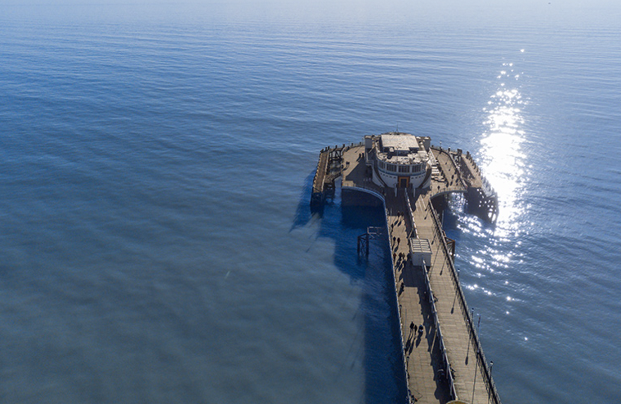
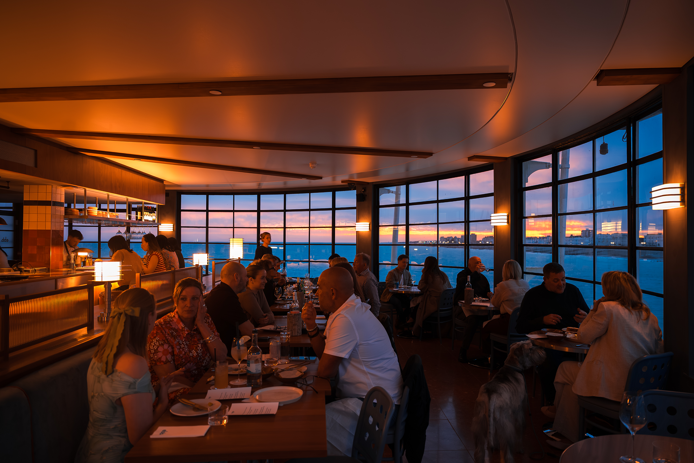
Ebb is a new restaurant on Worthing Pier, created by the team behind the Perch brand. Occupying a former restaurant space, it seats around thirty covers and positions itself as the premium yet accessible dining destination that Worthing has lacked to date: refined enough to feel special, relaxed enough to visit regularly.
Good Noise were approached to name the restaurant and build its brand identity from the ground up. The scope covered brand positioning, naming, logo creation, brand assets, concept visuals, and brand guidelines, with our creative and strategic work then handed over to their in-house team for delivery.
The restaurant needed to occupy a precise position within Worthing’s dining scene: more considered than a casual seafront café, less formal than the fine dining restaurant that had previously occupied the site. It also needed to stand entirely on its own, not as a sub-brand of Perch, but as a distinct identity with its own personality and visual language.
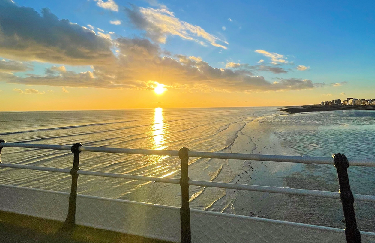
The location was both an asset and a constraint. Worthing Pier is spectacular, but any brand built around it risks leaning too heavily on the obvious. Our aim was to draw on the location without being defined by it.
We began with a brand positioning workshop to define the restaurant’s DNA before moving into the naming and visual identity work. Working closely with the client team, we mapped the competitive landscape across the south coast.
This process defined the brand’s DNA and informed every creative decision that followed. The essence we arrived at was warm, refined hospitality with heart, where every detail matters.
Next we focused on the name. We needed a word rooted in the location without reducing it to a postcard. We landed on Ebb, the natural, quiet withdrawal of the tide. It carries a connection to the sea without cliché, while suggesting ease, rhythm, and the particular pleasure of time passing without pressure.
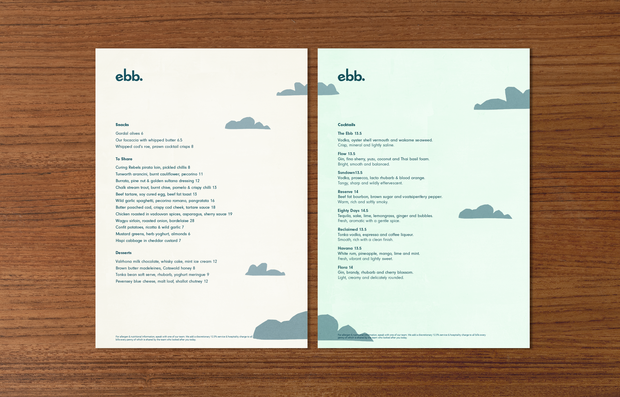
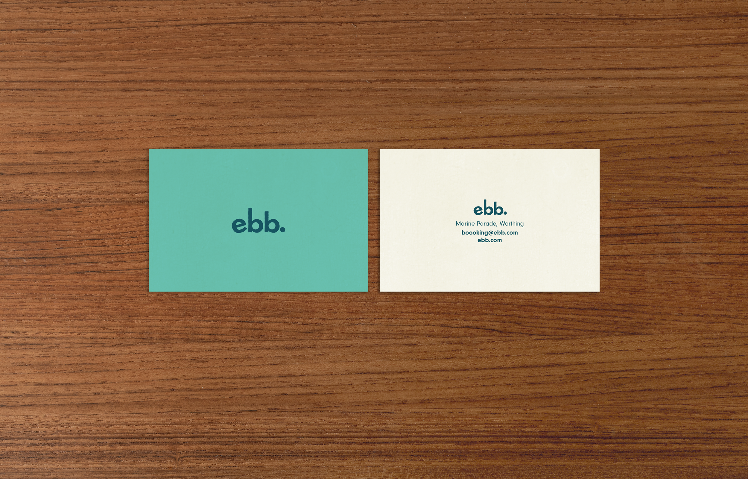
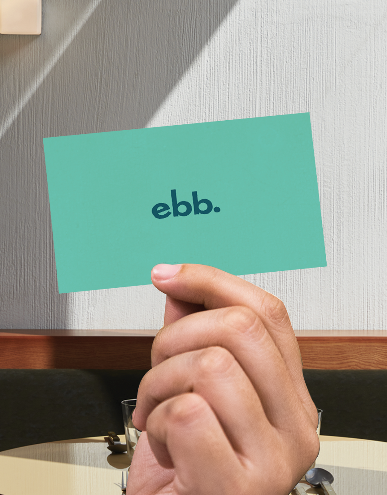
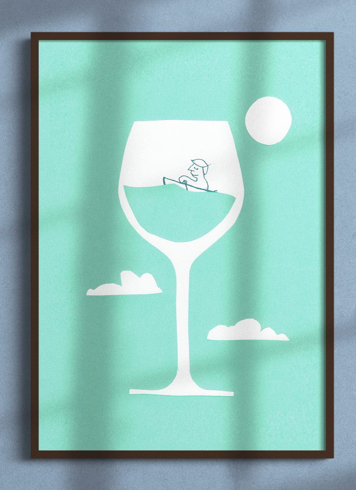
The logo uses a customised typeface with a deliberately rough finish. Each character was adjusted to create a subtle sense of movement, with letters that bob gently as if riding low water. The mark feels handmade and considered rather than polished or remote.
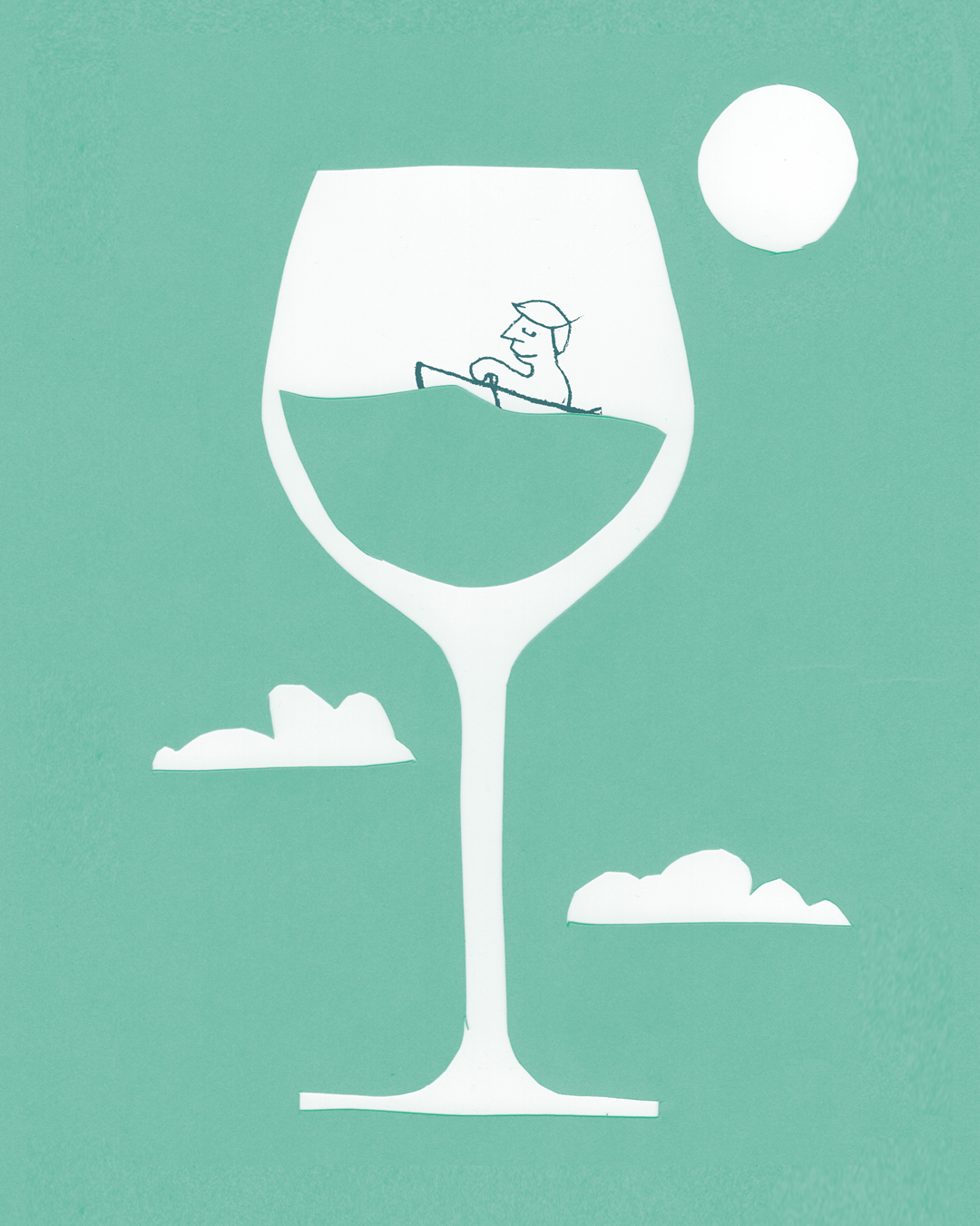
The colour palette was developed in close reference to the interior direction created by Pattern Haus, the project’s interior designers, with deep teal and warm off-white as the primary colours, complemented by sage green, blush, and pale blue. The typography was chosen for its clean, modern, and quietly cheerful character.
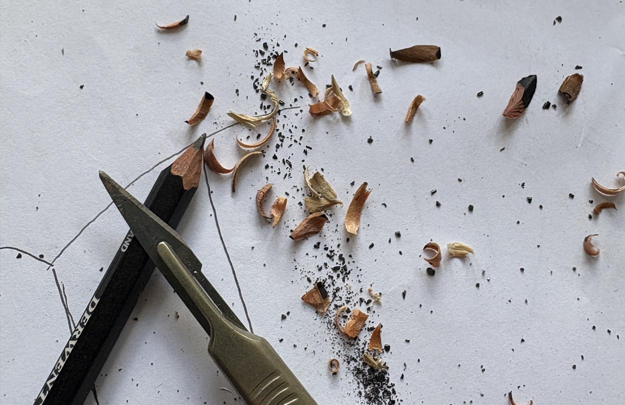
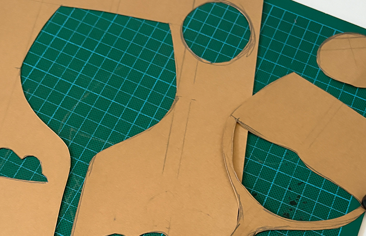
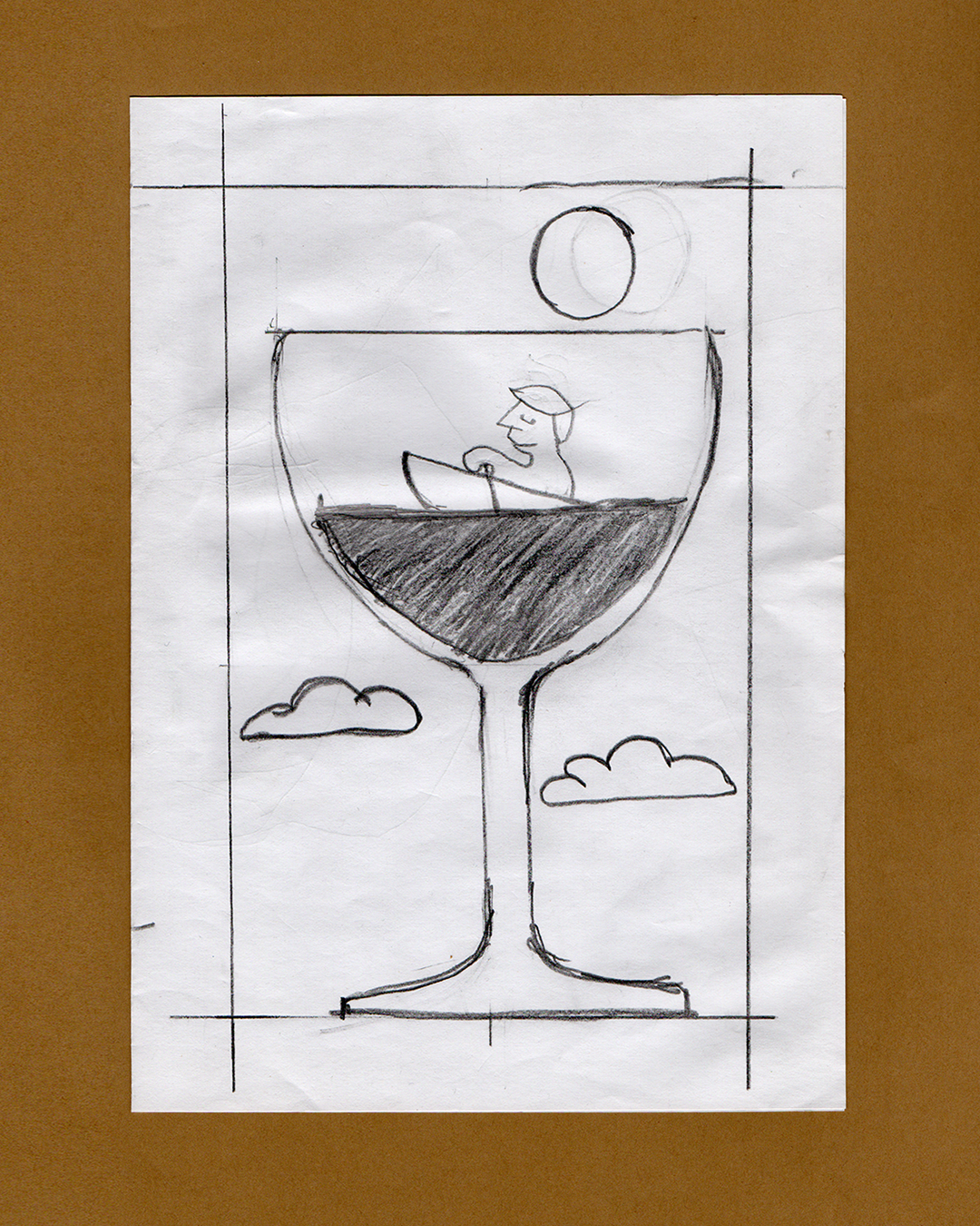
For the broader visual system, we drew on hand-cut collage and pencil illustration, creating two-colour artwork that was scanned and recoloured. The result feels tactile and characterful, with organic shapes, natural materials, and a lightness of touch.
We also created a range of animations to showcase the concept, which could be used across digital applications and social media.